most vc brands look the same. abstract shapes. safe colors. forgettable.
glilot came to us because they're not most vcs.
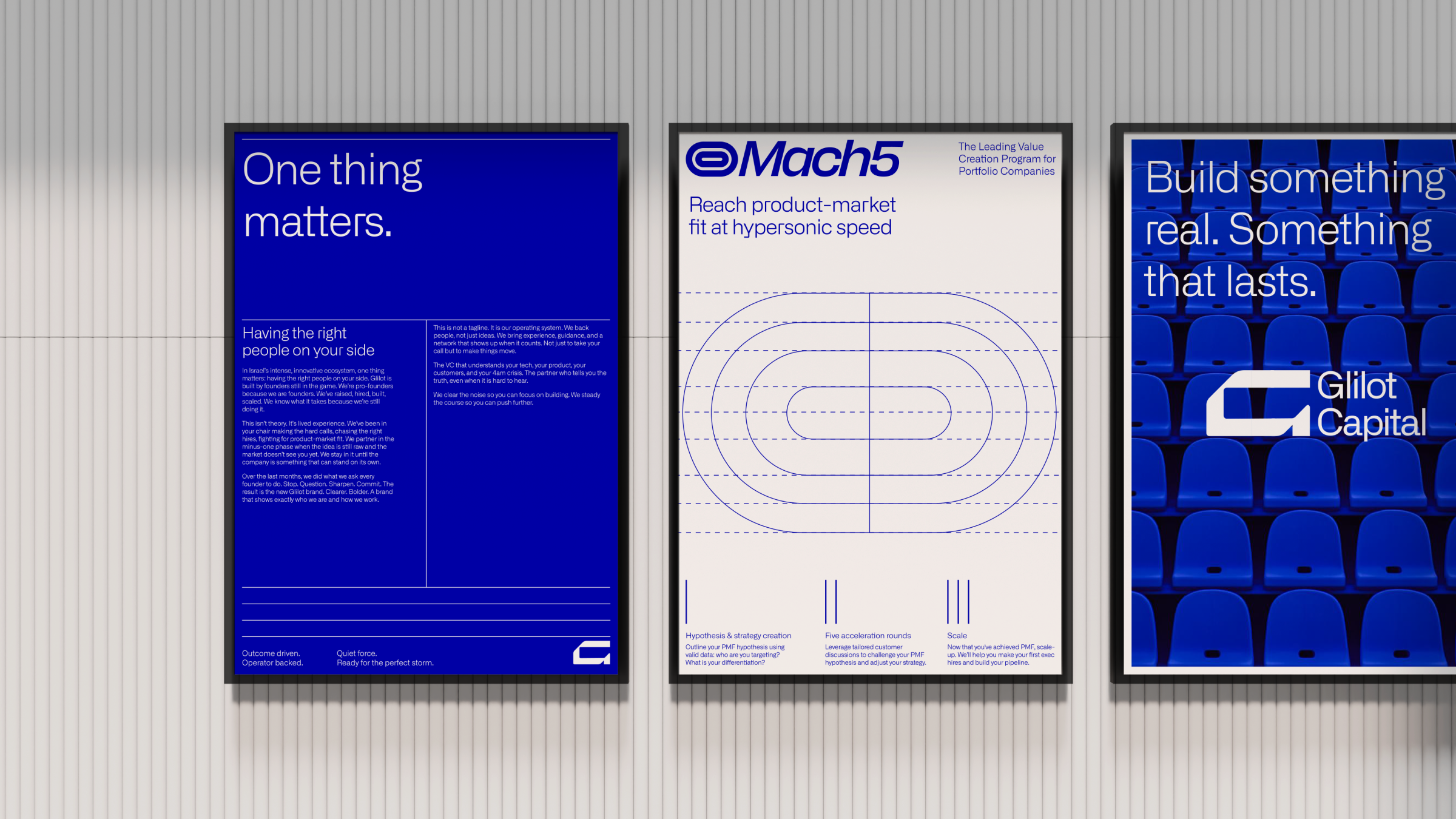
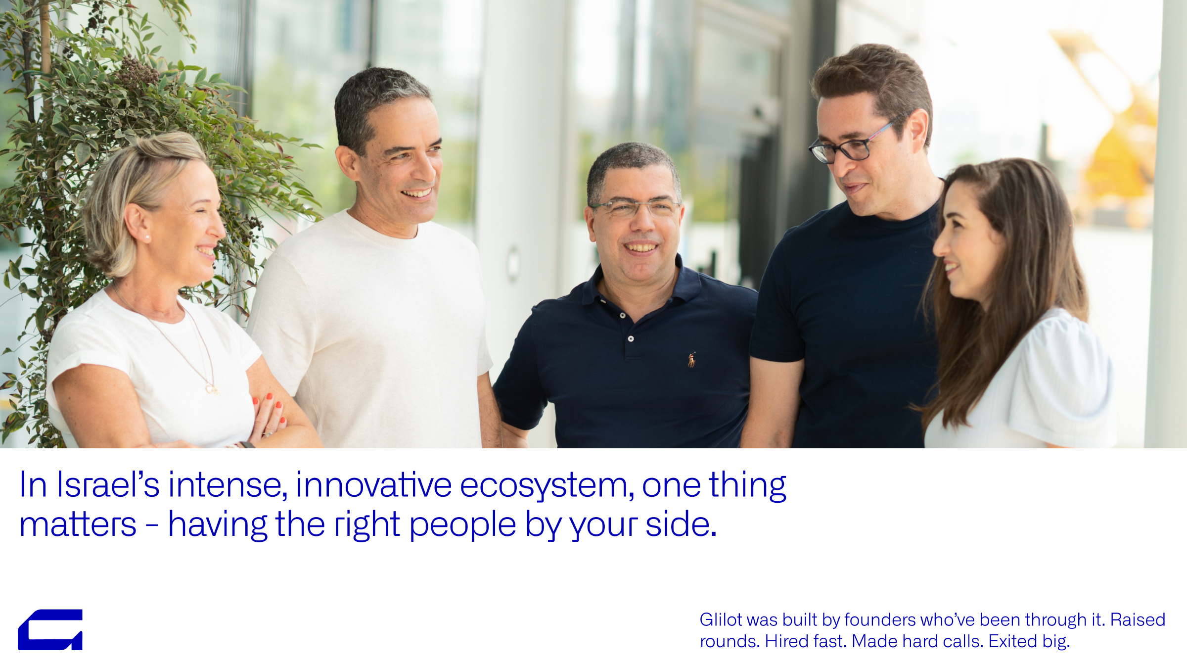
we sat with their partners and listened. these are founders who built companies, raised rounds, hired fast, made hard calls. they know what it takes and what it breaks. they didn't want a brand that looks like money. they wanted one that feels like conviction.
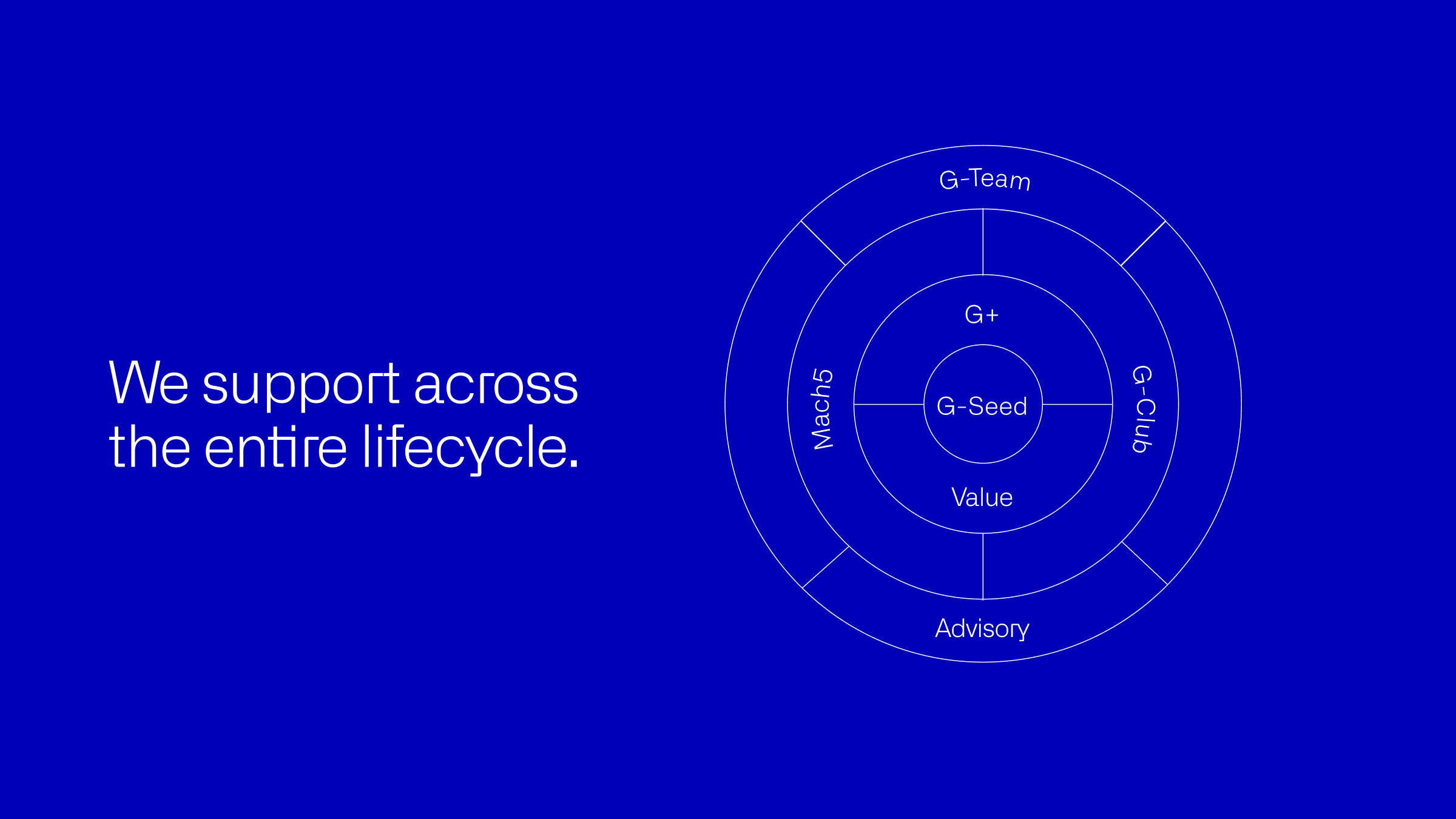
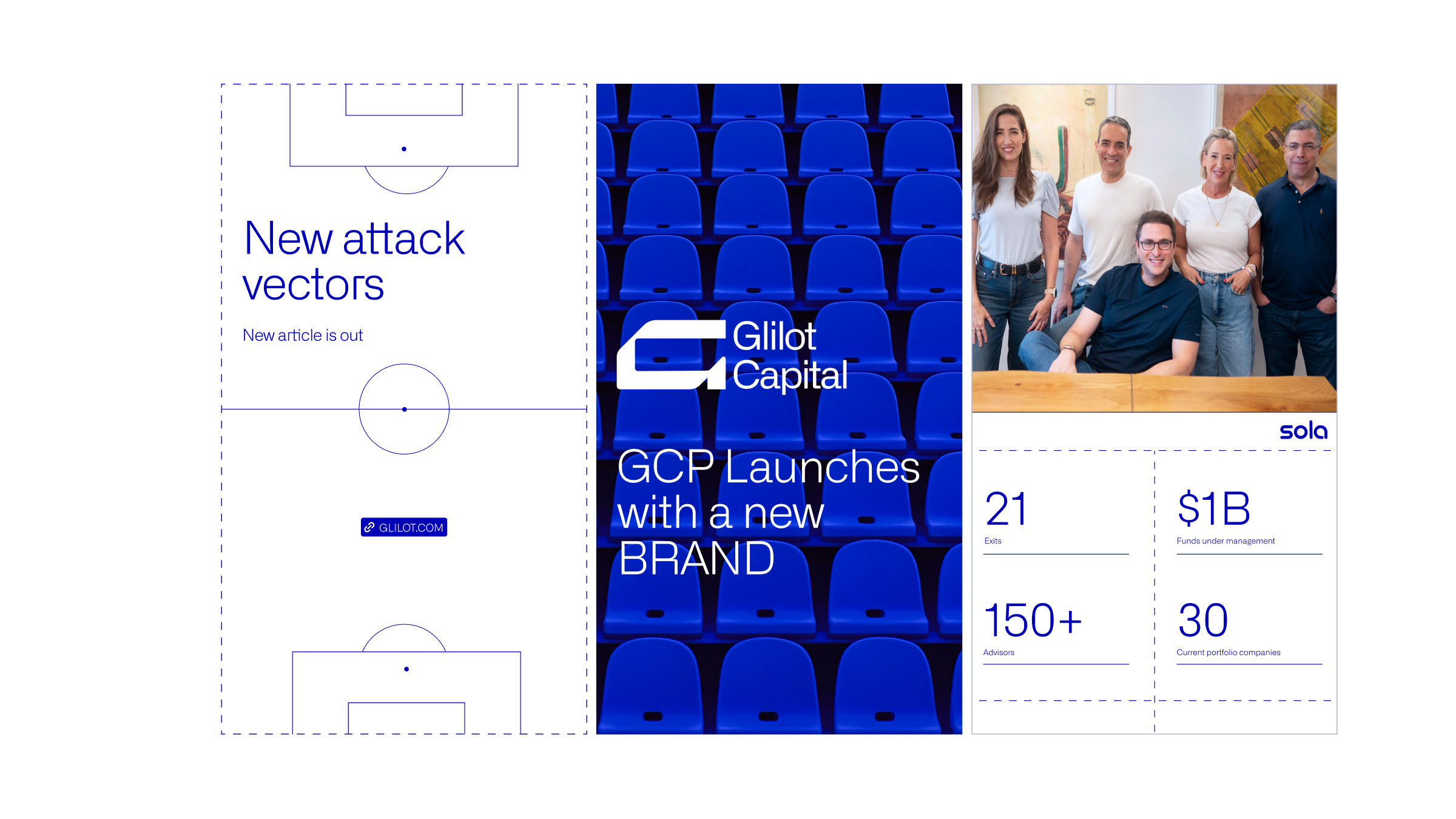
in israel's intense ecosystem, one thing matters. having the right people on your side. glilot backs founders in cyber, AI, infrastructure. the hard stuff. the technologies that power the modern world. they go deep. rooted in what matters, not what trends.
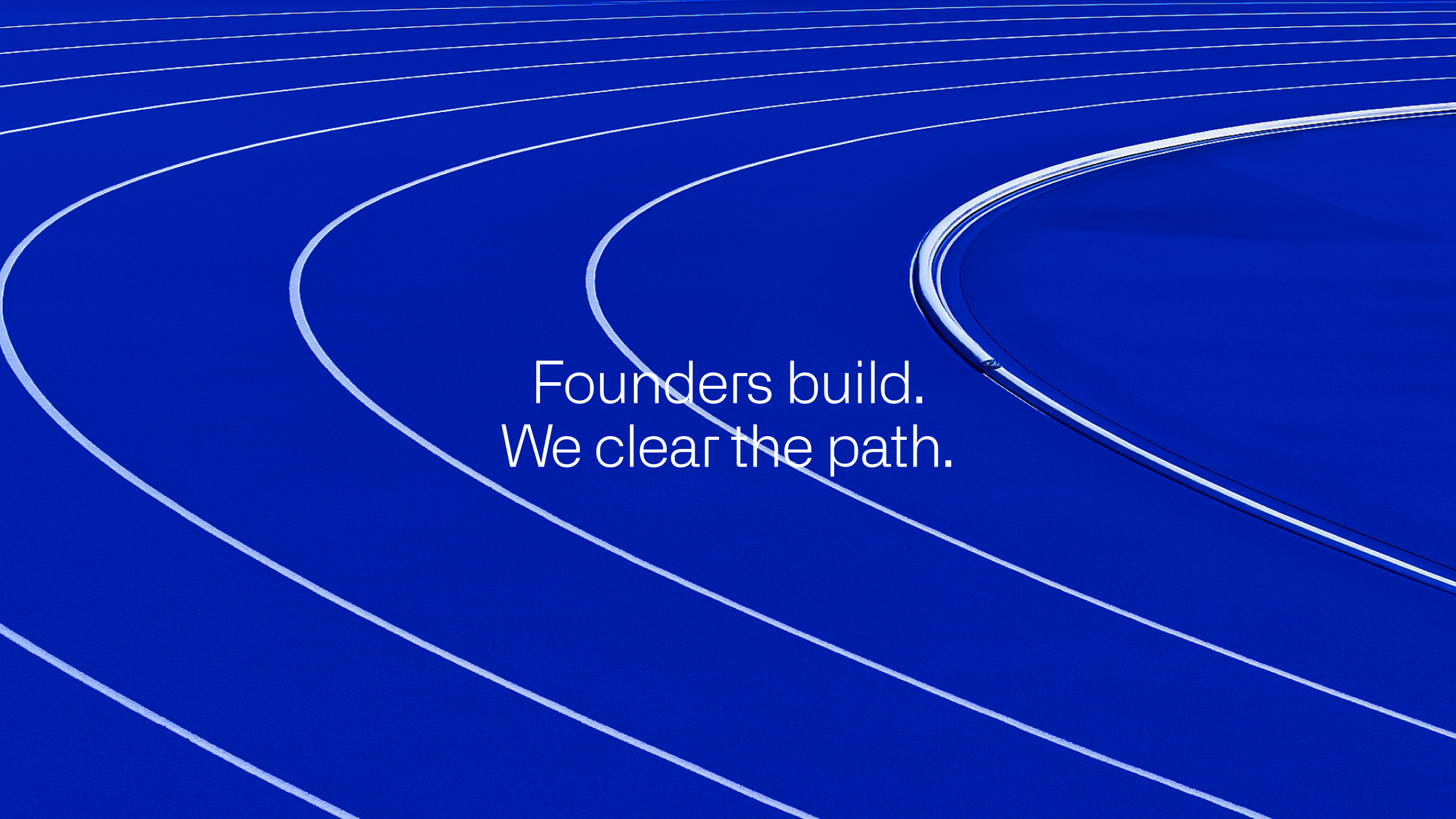
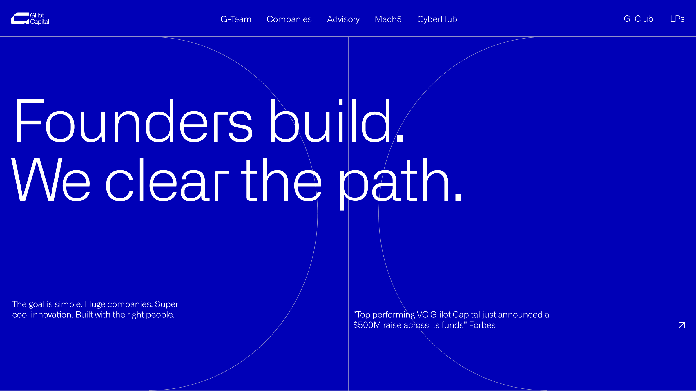
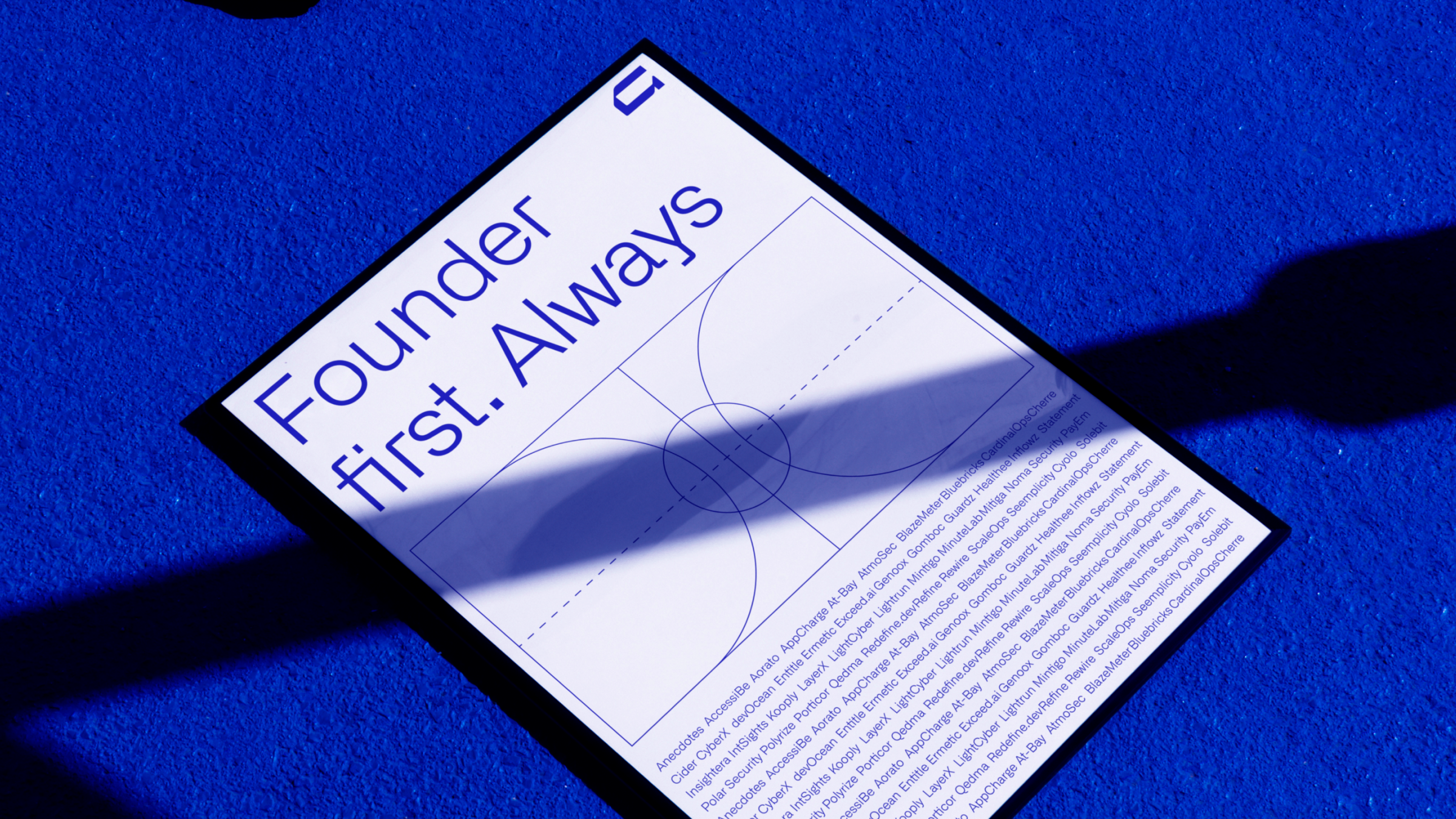
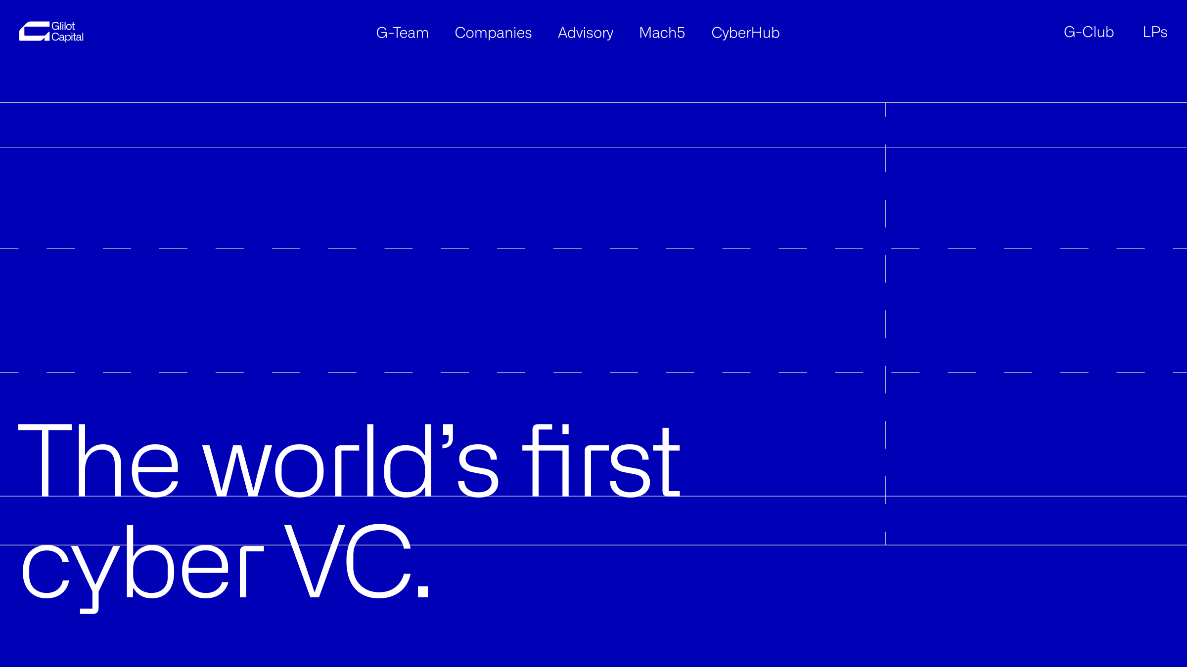
we kept coming back to one phrase. founders build. we clear the path.
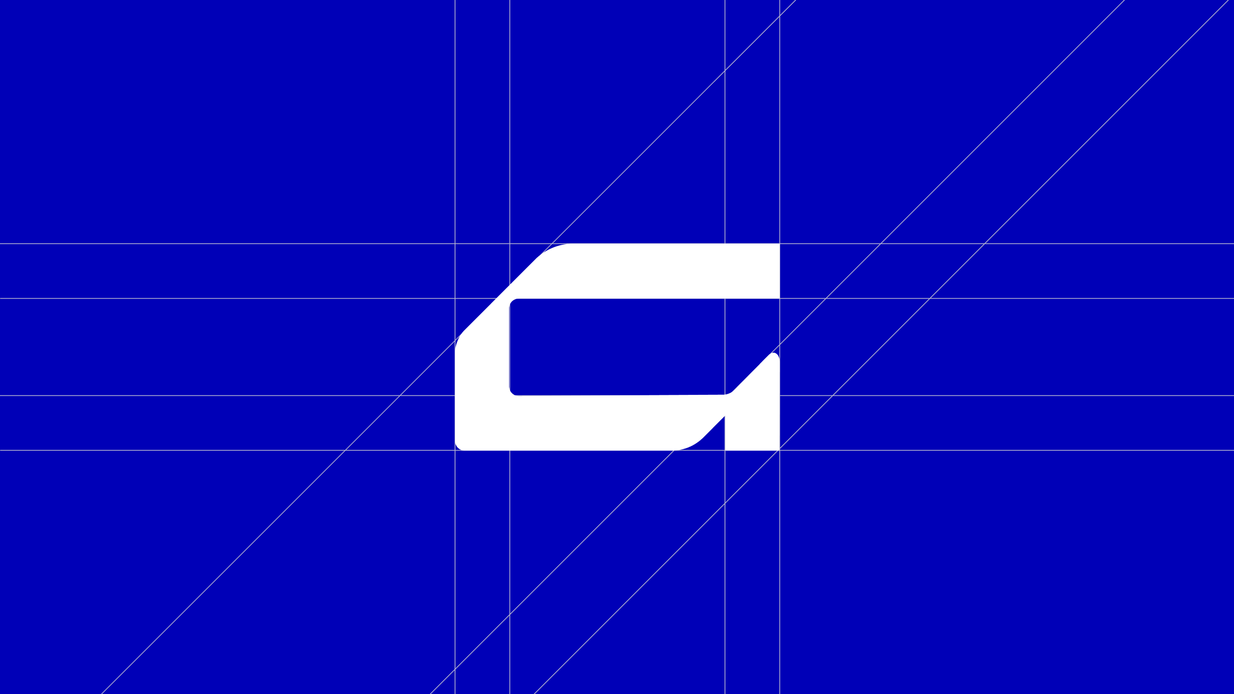
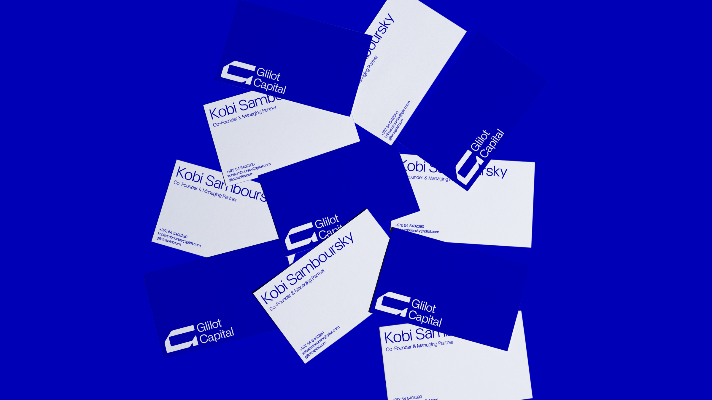
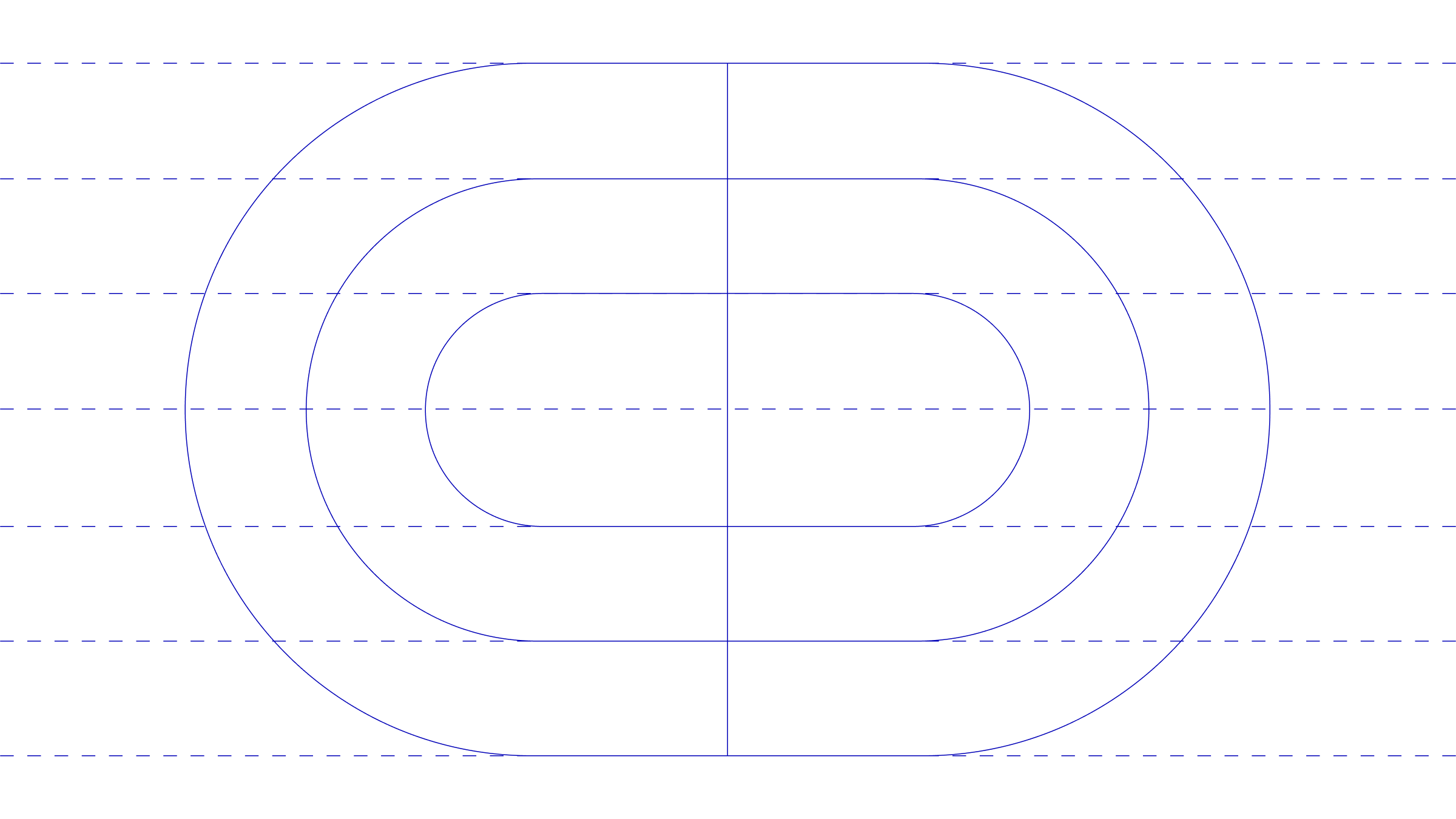
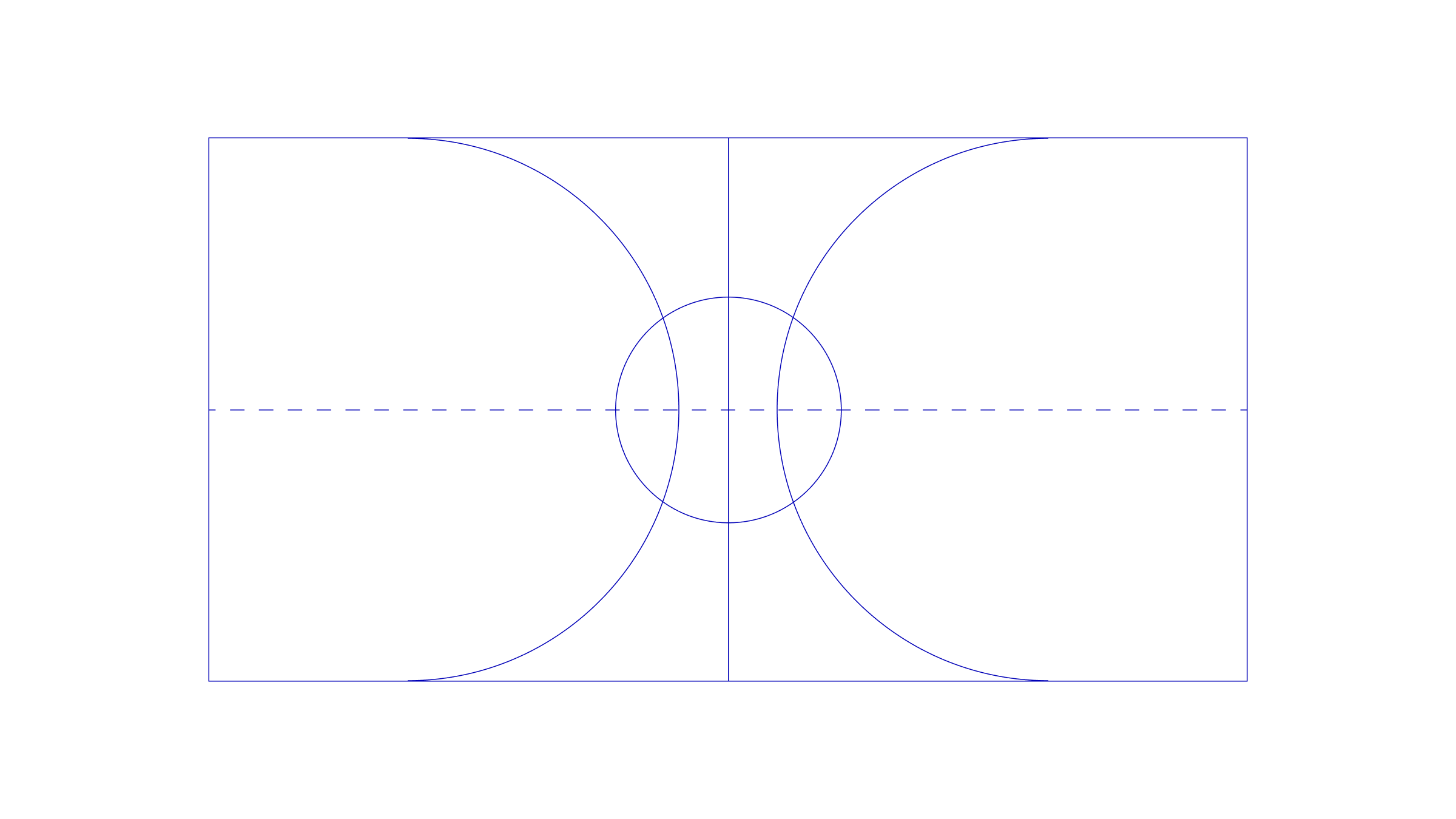
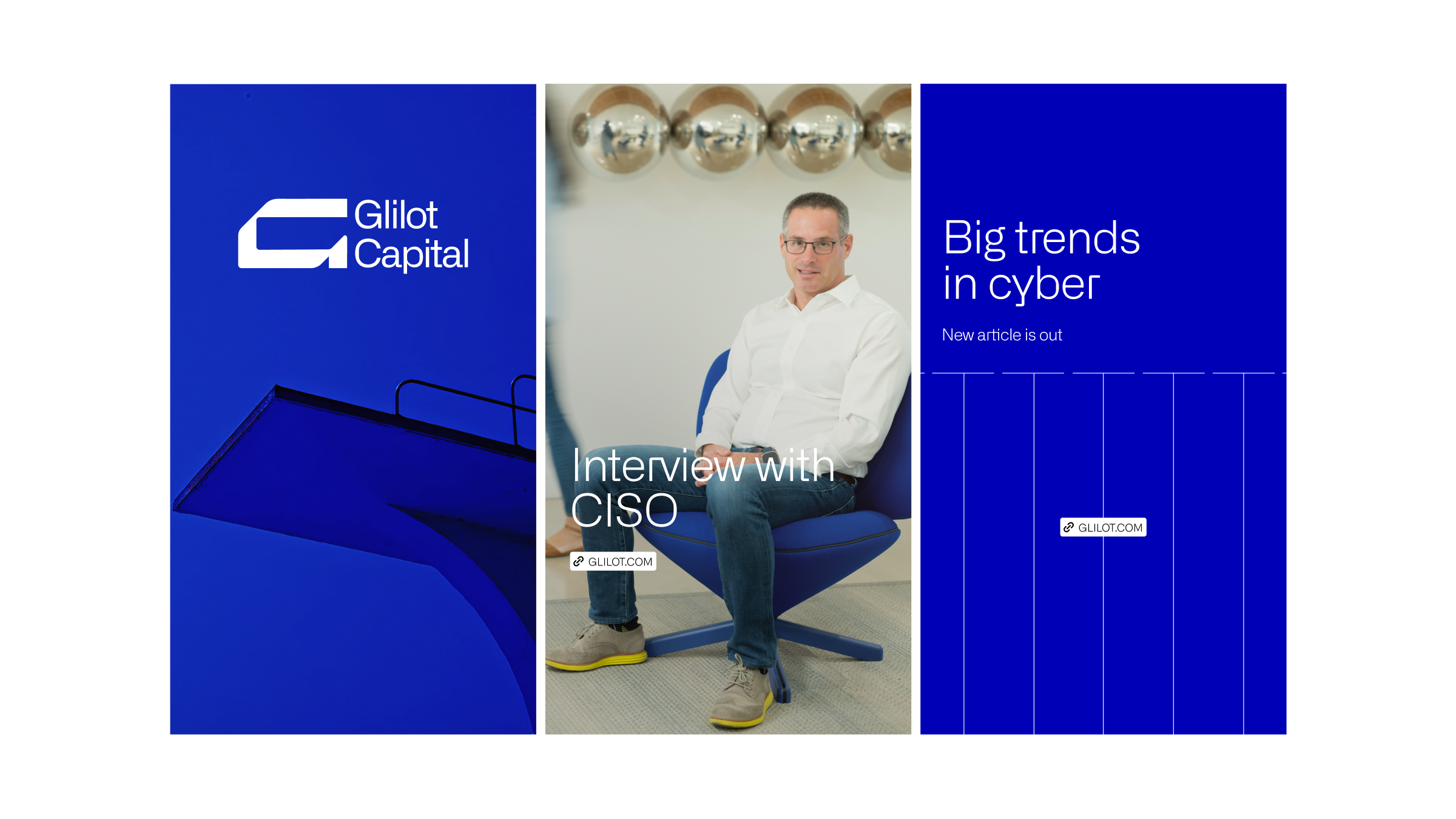
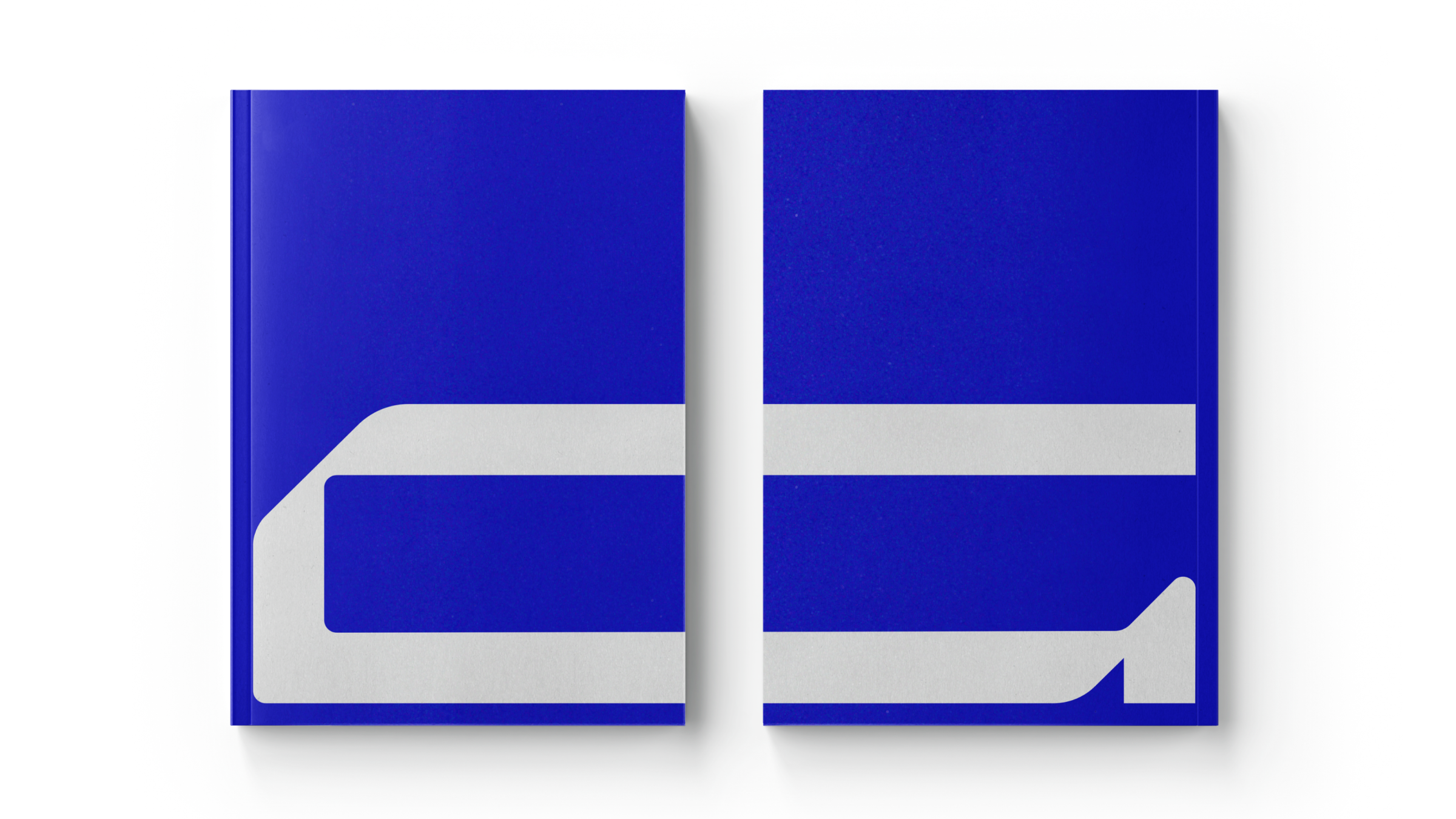
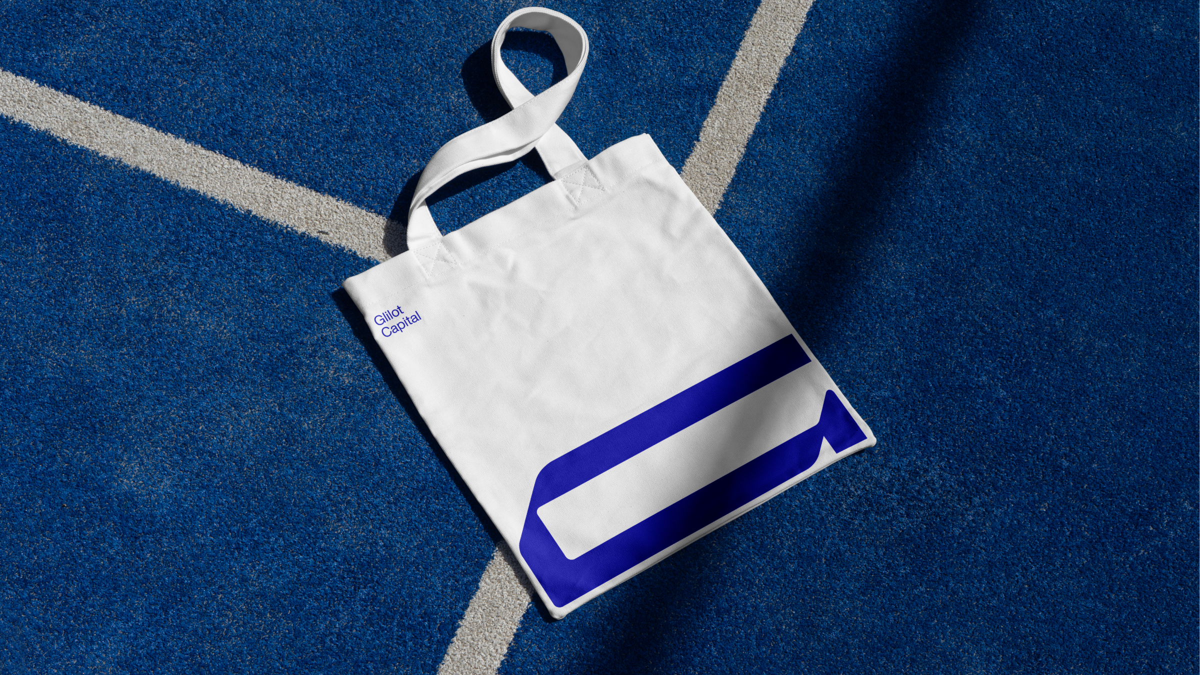
the mark needed to carry that weight. something that moves forward without hesitation. something bold but not loud. we landed on a form that feels like momentum. a shape that clears space. direct. no decoration. no apology.
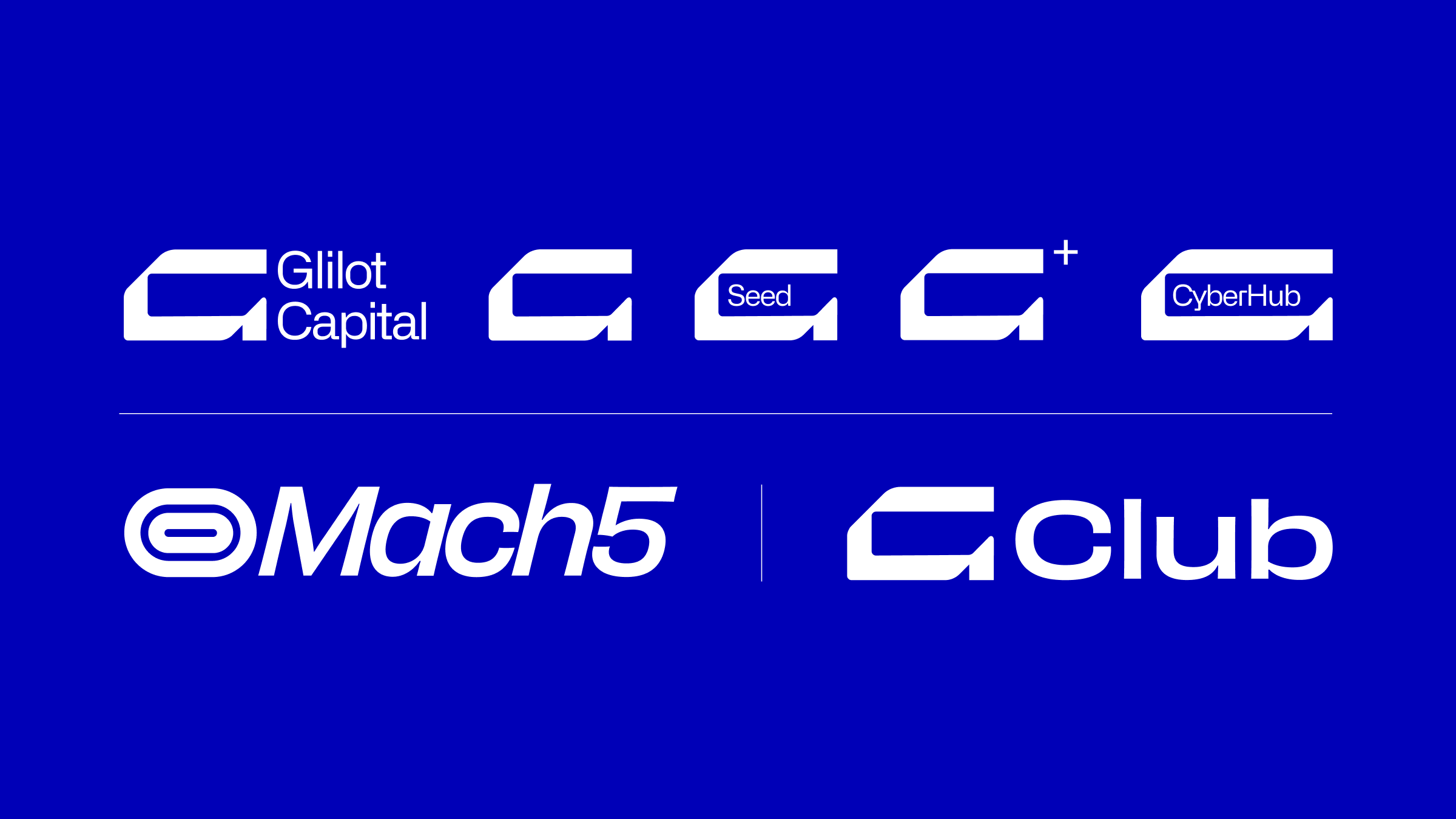
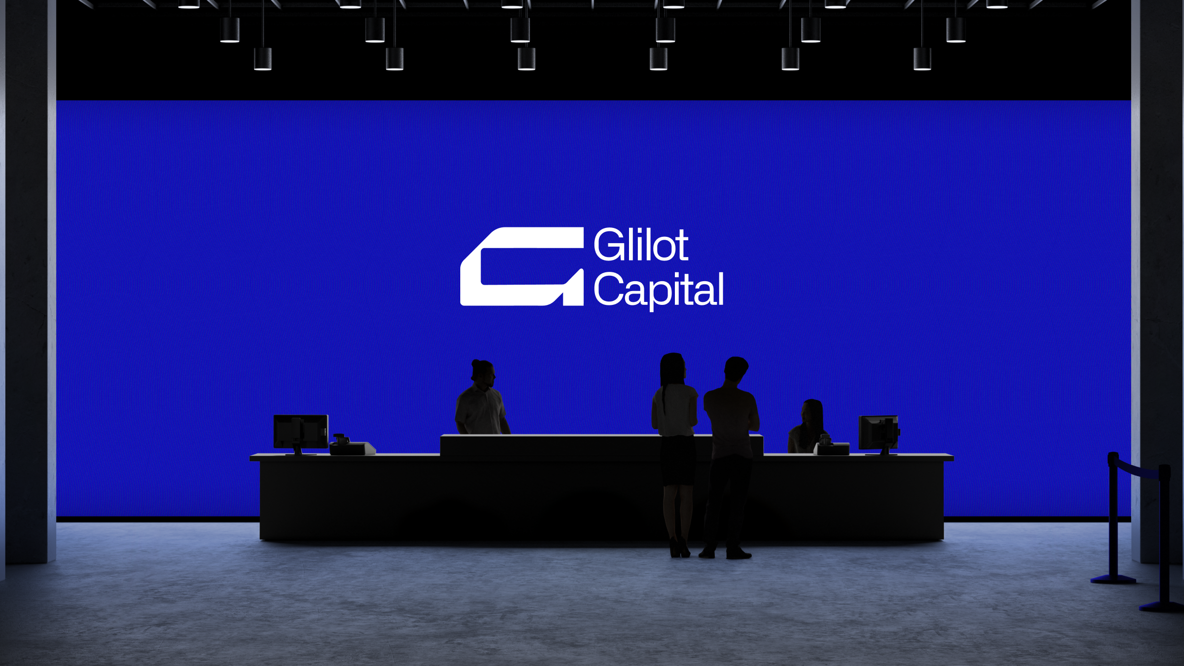
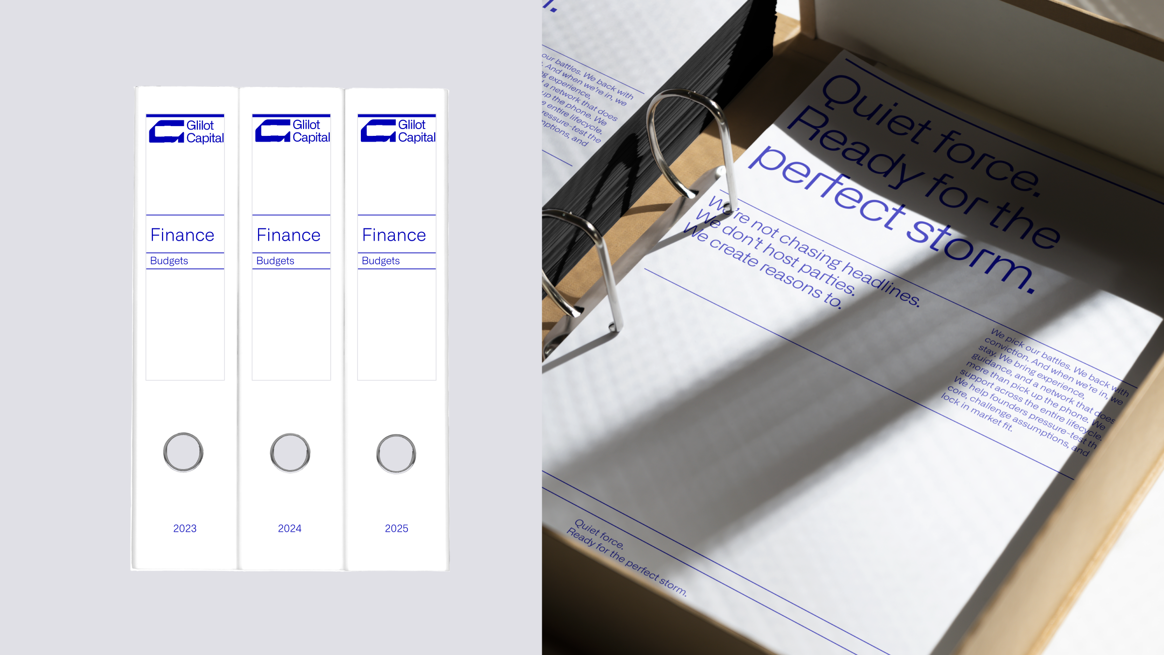
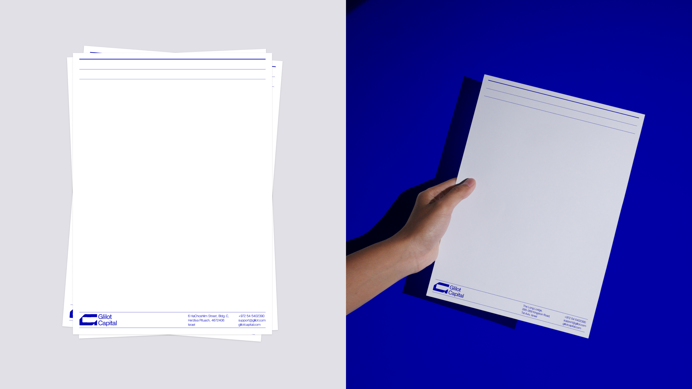
the blue isn't corporate blue. it's electric. alive. the kind of energy you feel in a room when something real is being built. we paired it with clean typography and sharp applications. every touchpoint says the same thing. we're not chasing headlines. we create reasons to.
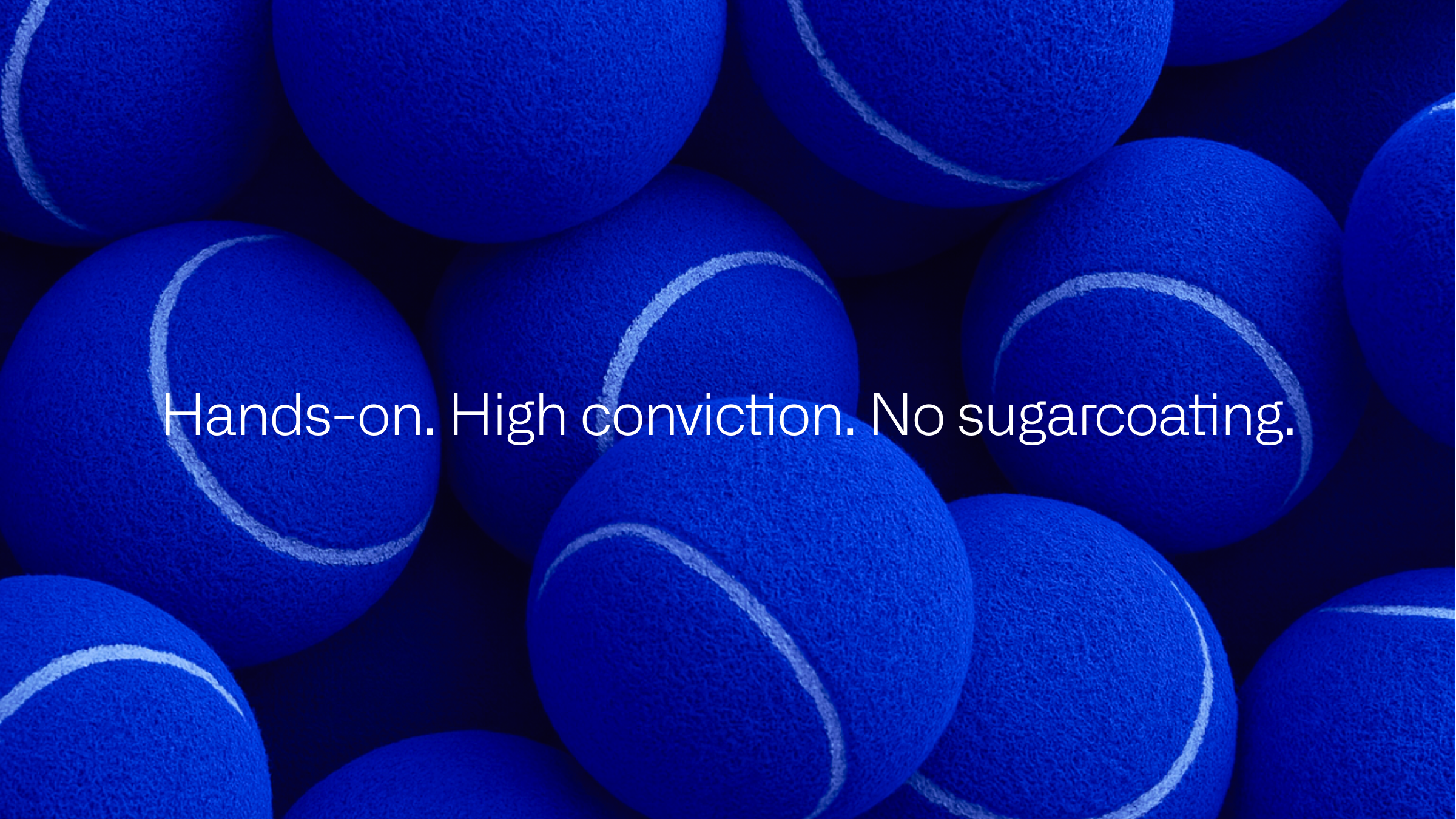
high conviction. no sugarcoating. quiet force. ready for the perfect storm.
creative director | eden vidal, inbal vidal
brand designer | atalya beh haim, kate holub
designer | tal mokady, margarita golubeva, hadar lozon
photographer | mari ron