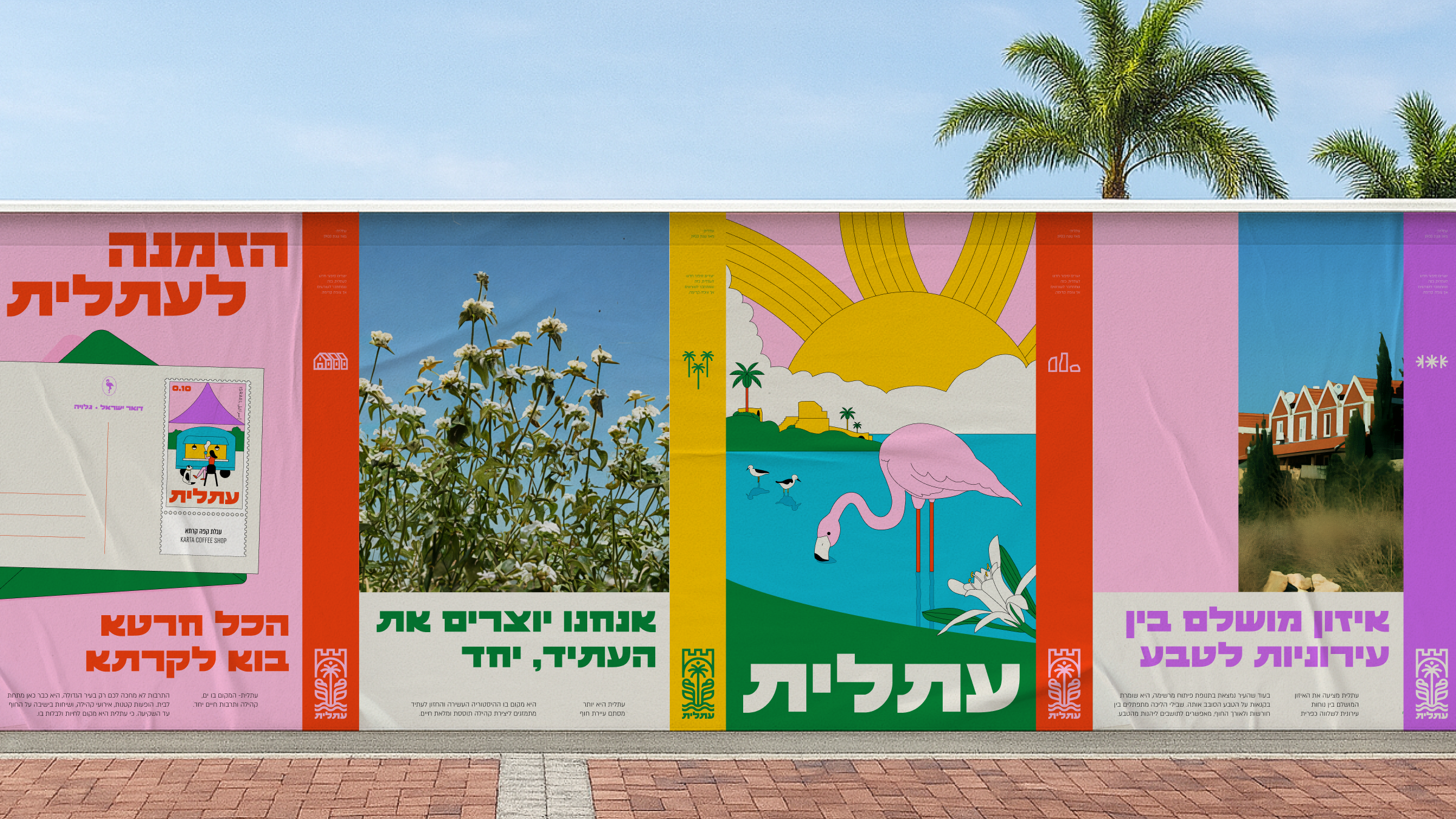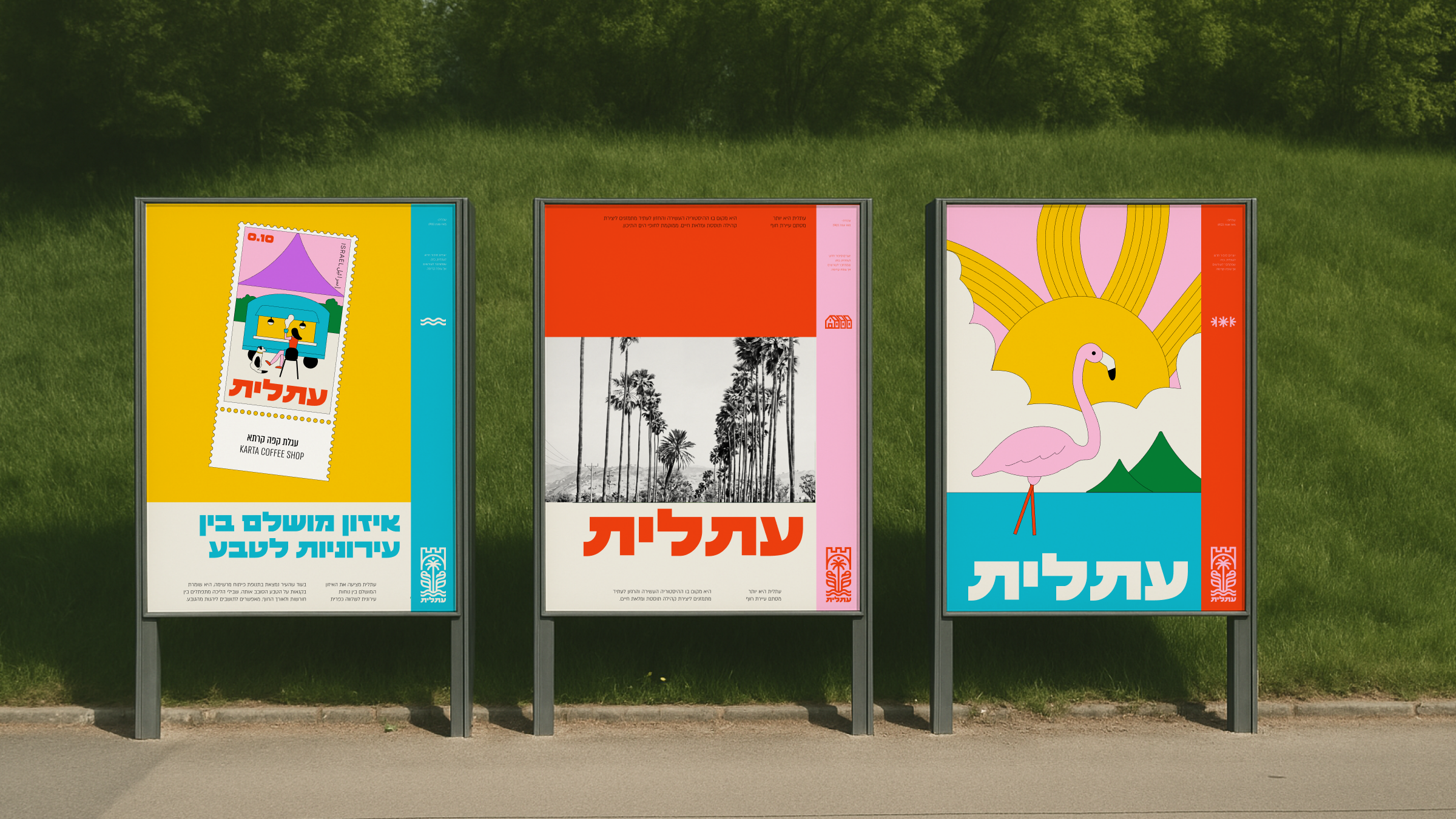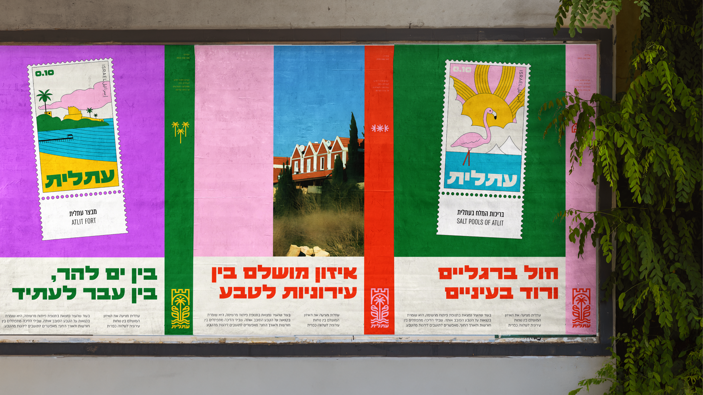
people hear the name and think development town or somewhere near haifa. but this place holds one of the deepest stories in israel. neolithic life, crusaders, refugees, salt, sea, farming, generations on generations. no one told it right. years of neglect. we came to fix that.
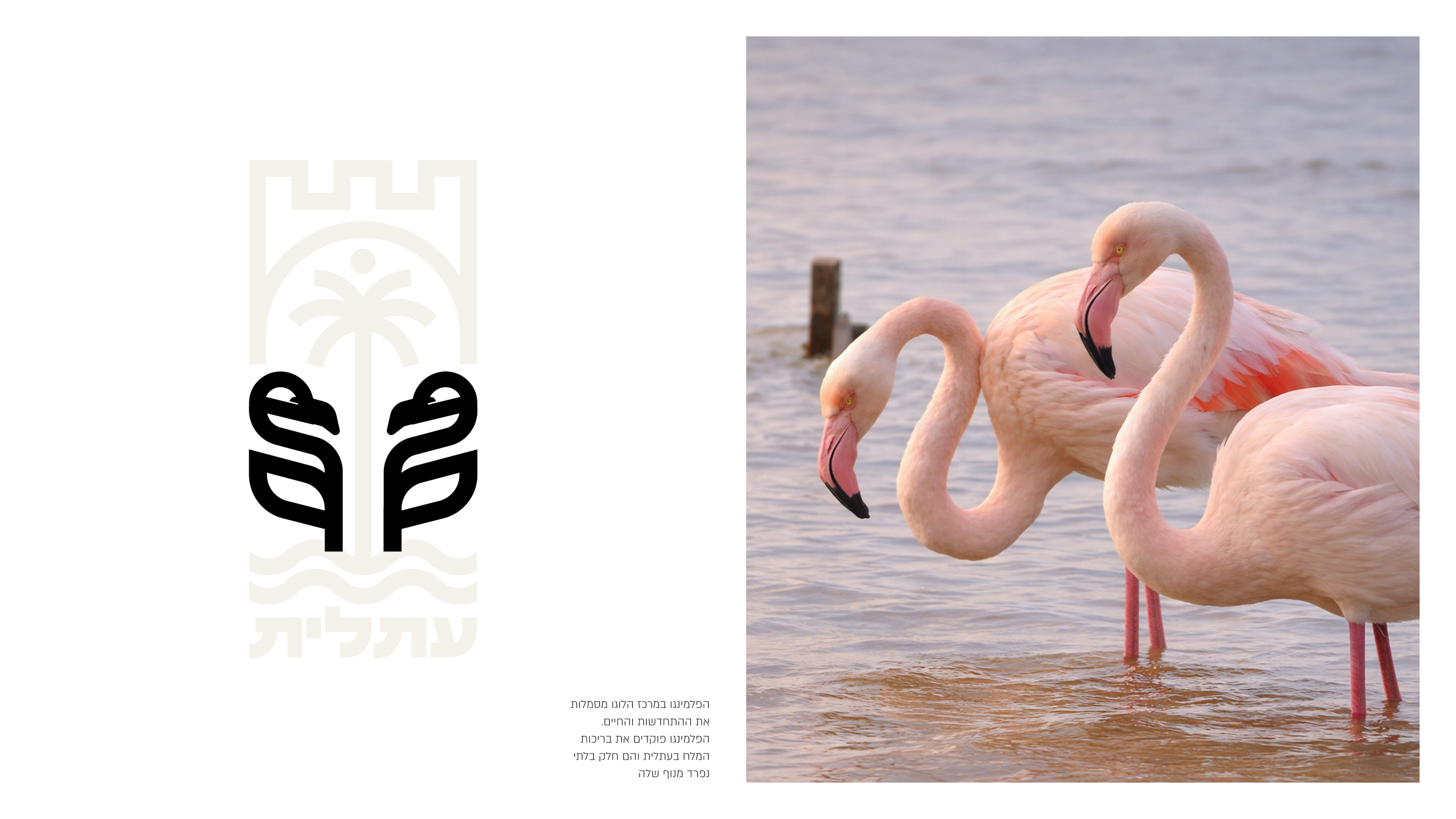
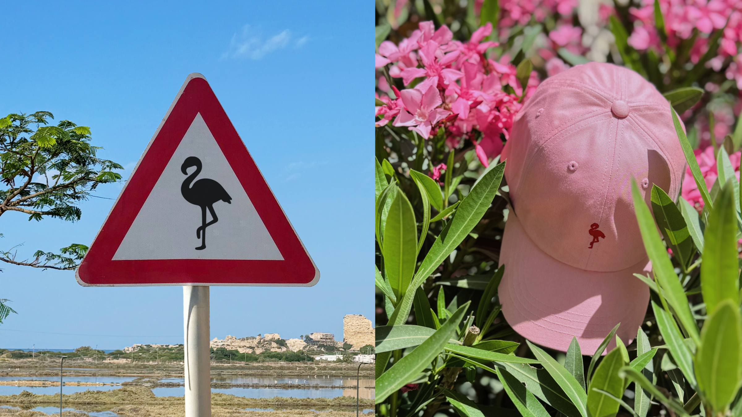
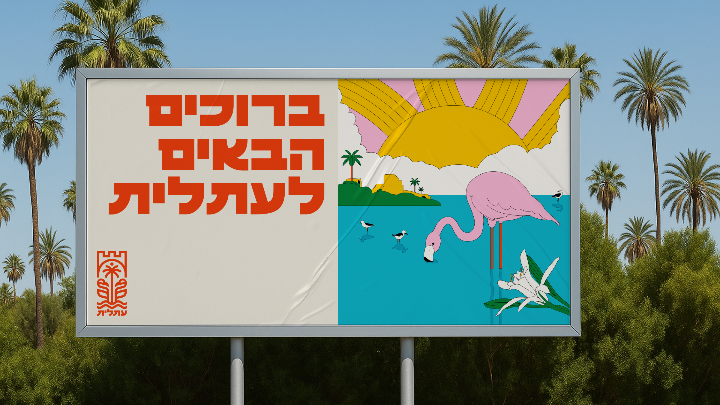
one friday, in the hard months after october 7, we sat at kereta coffee cart. railway tracks from the mandate era. salt ponds reflecting the sky. an 800 year old fortress turned army base. and pink flamingos standing there like it's normal. that mix made it clear. atlit needs someone to open their eyes and tell its story.
later that day it hit harder.
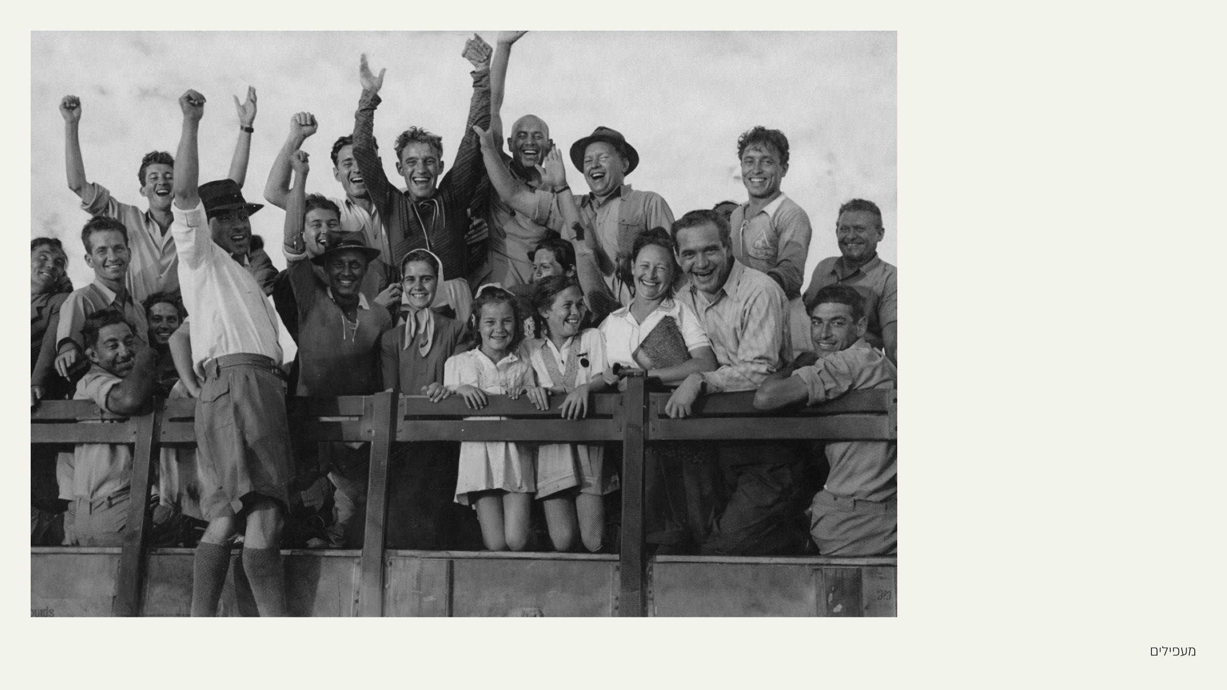
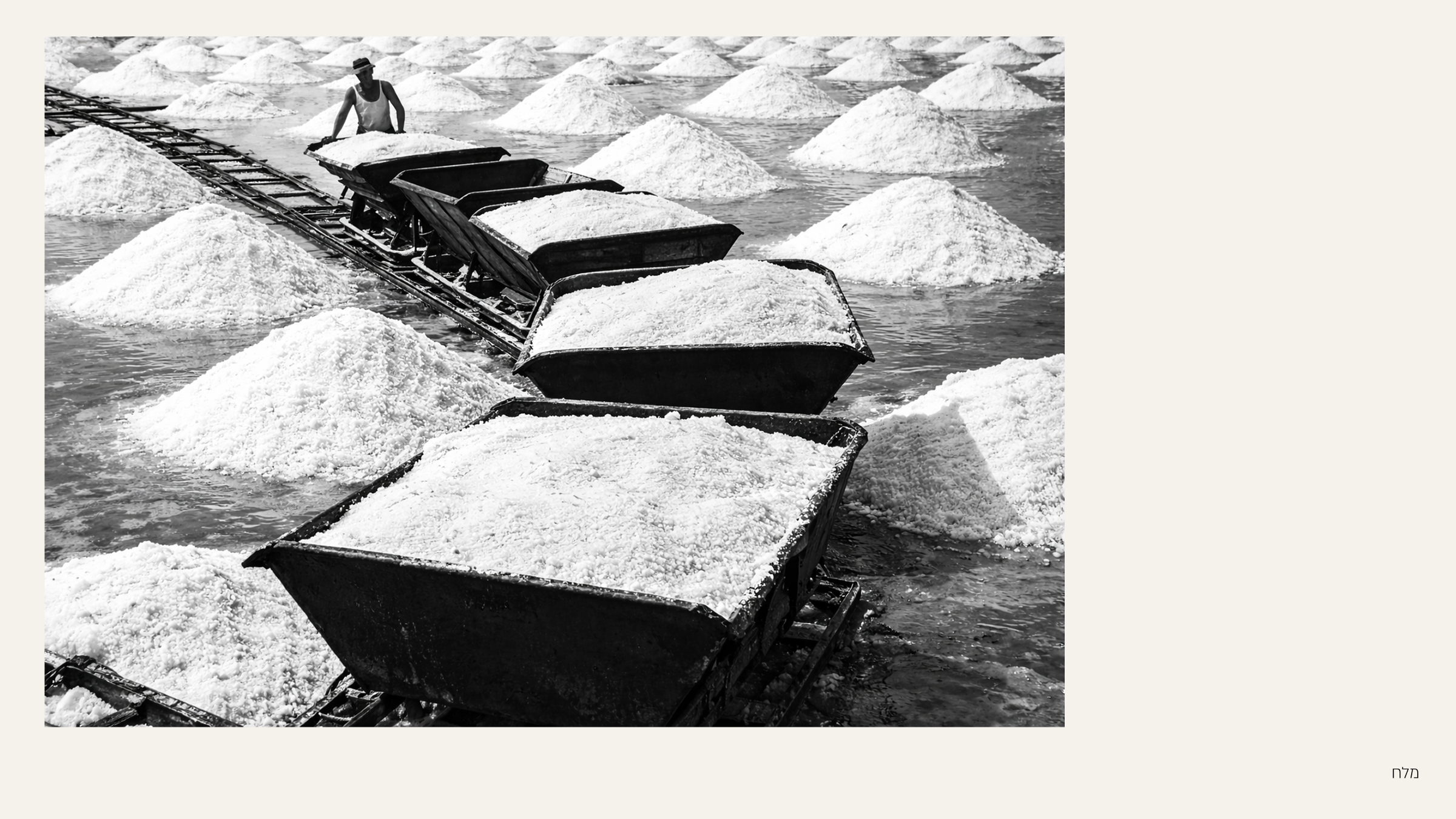
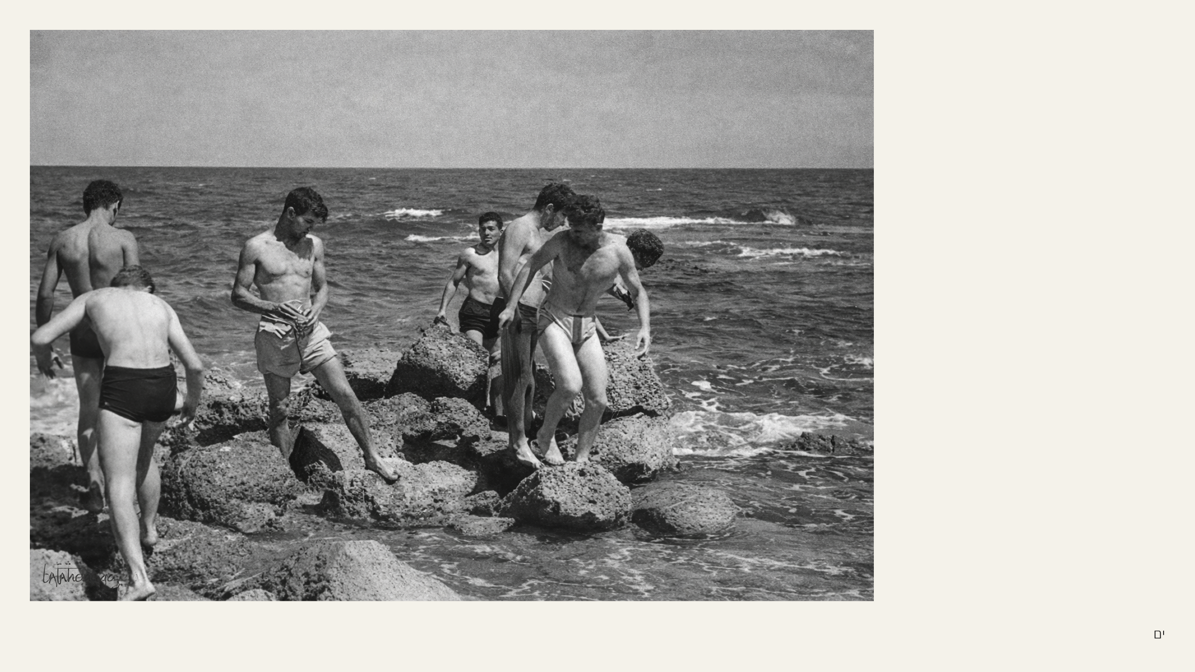
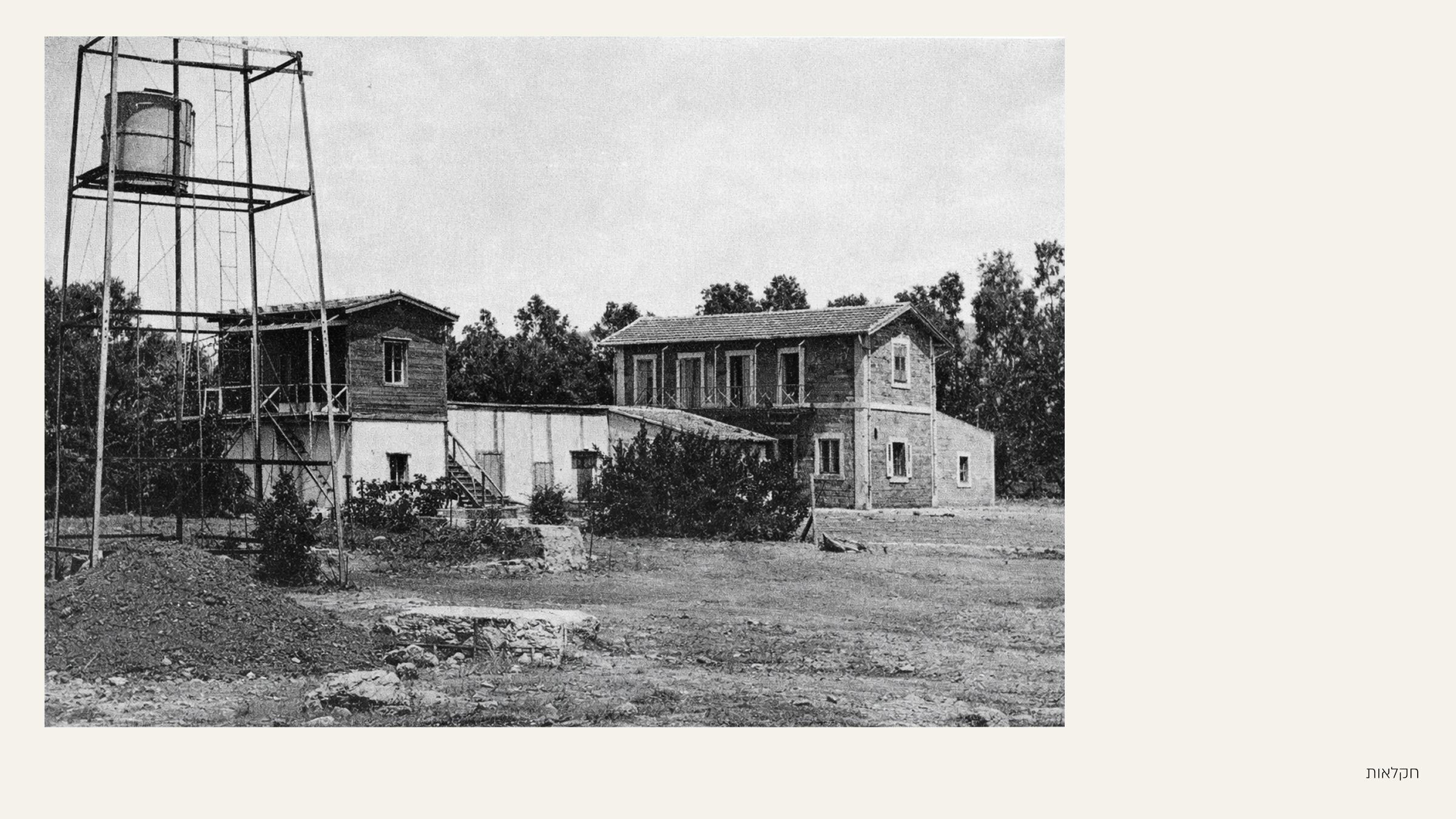
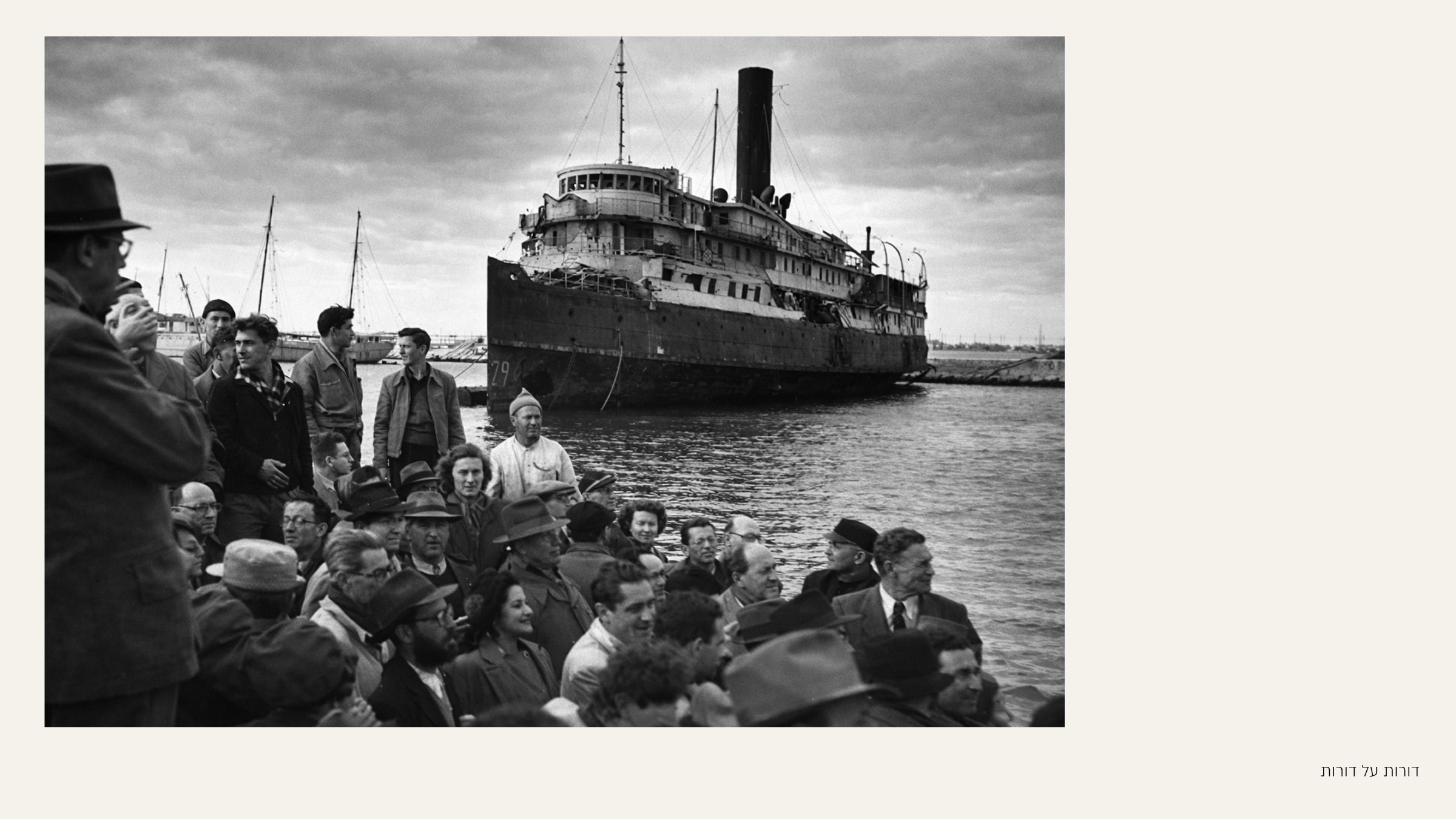
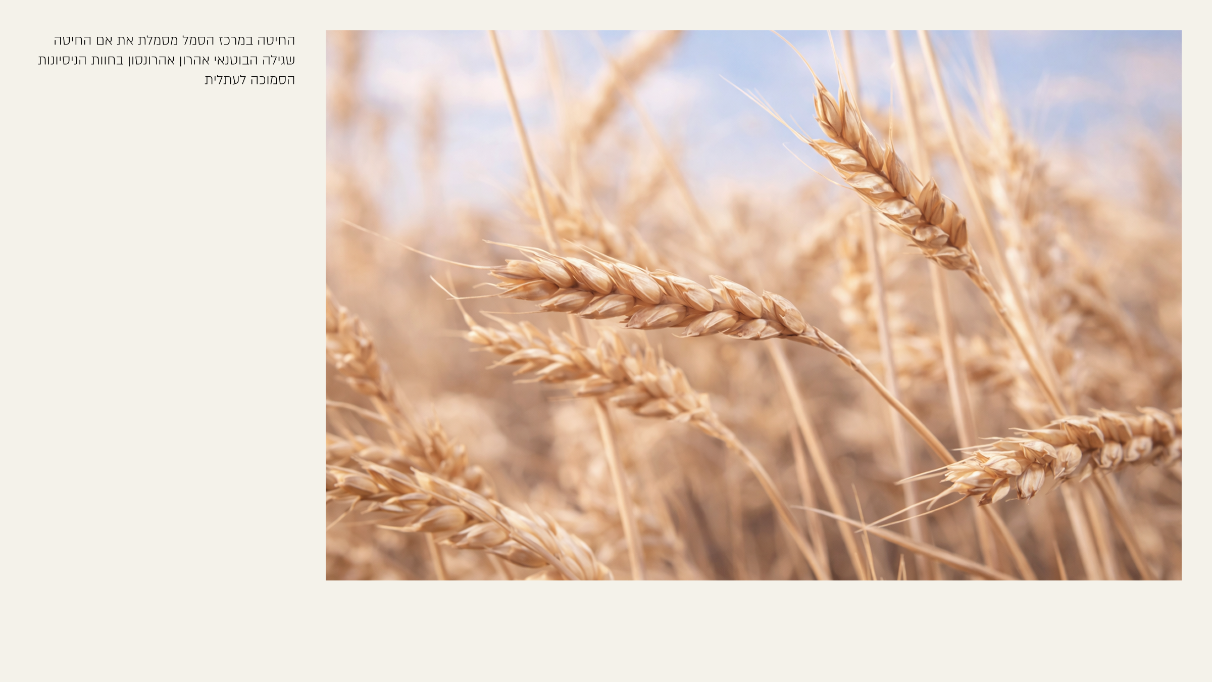
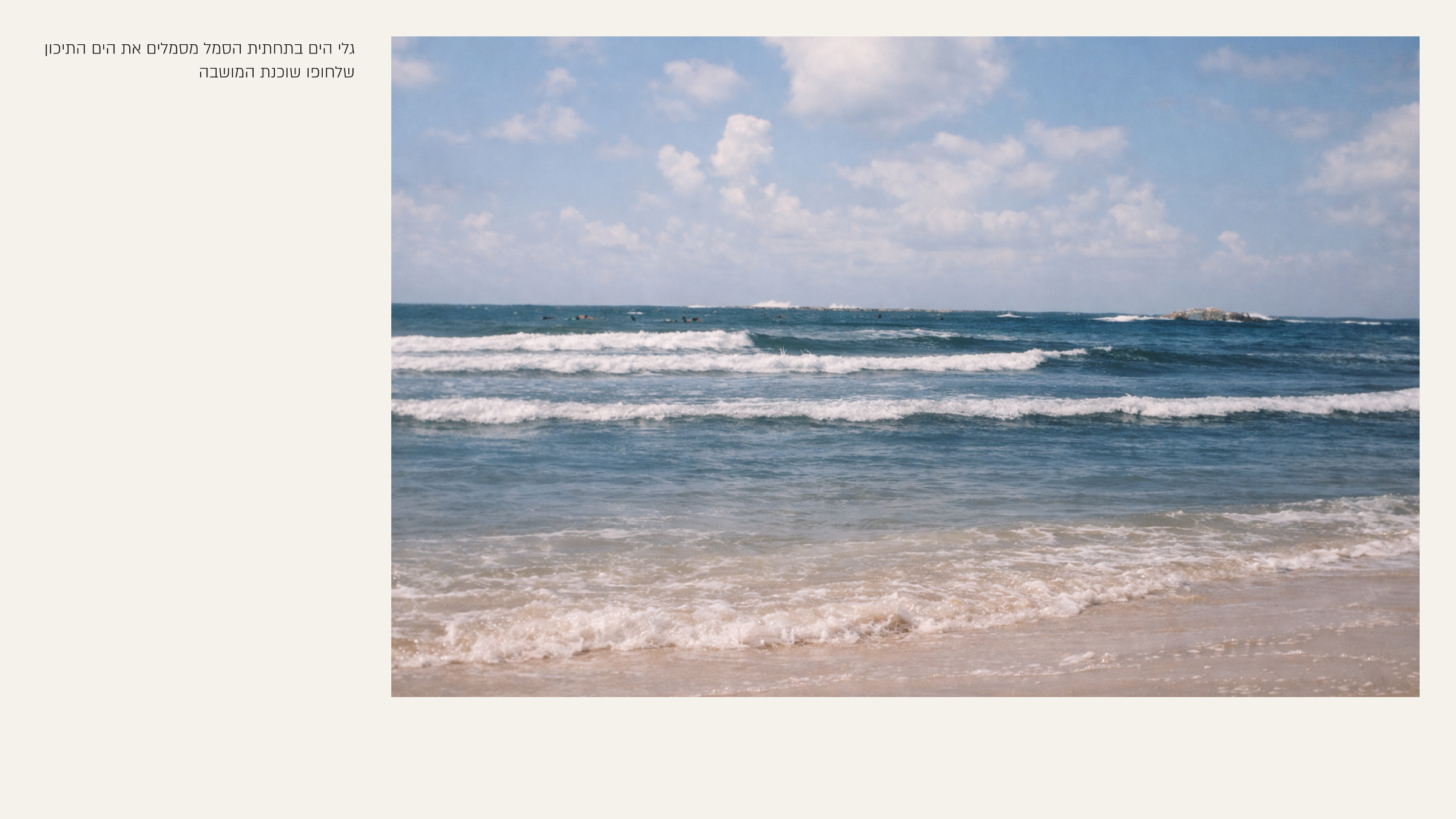
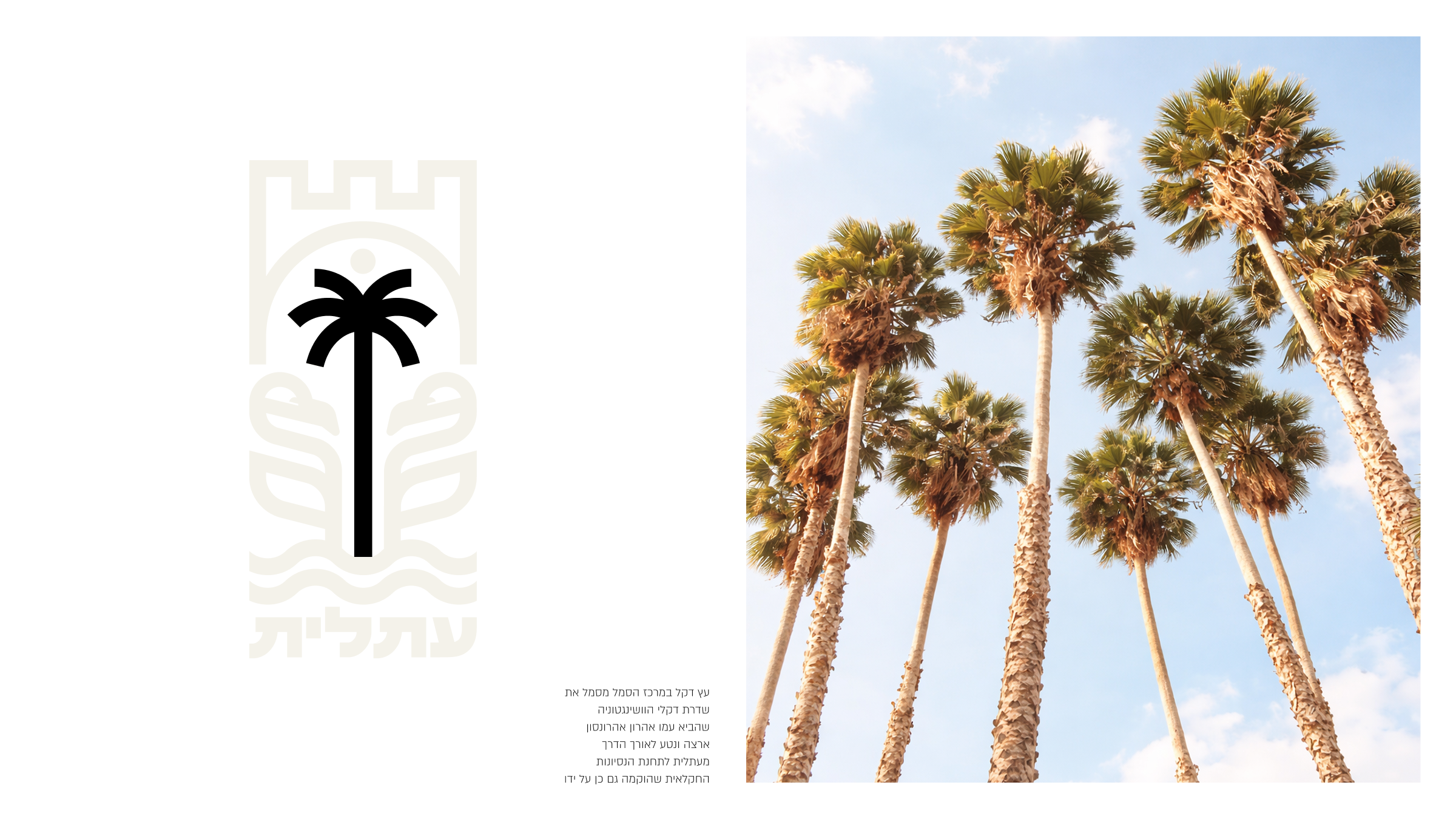
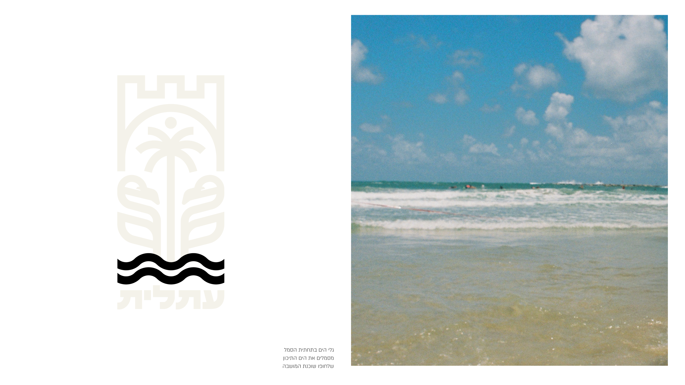
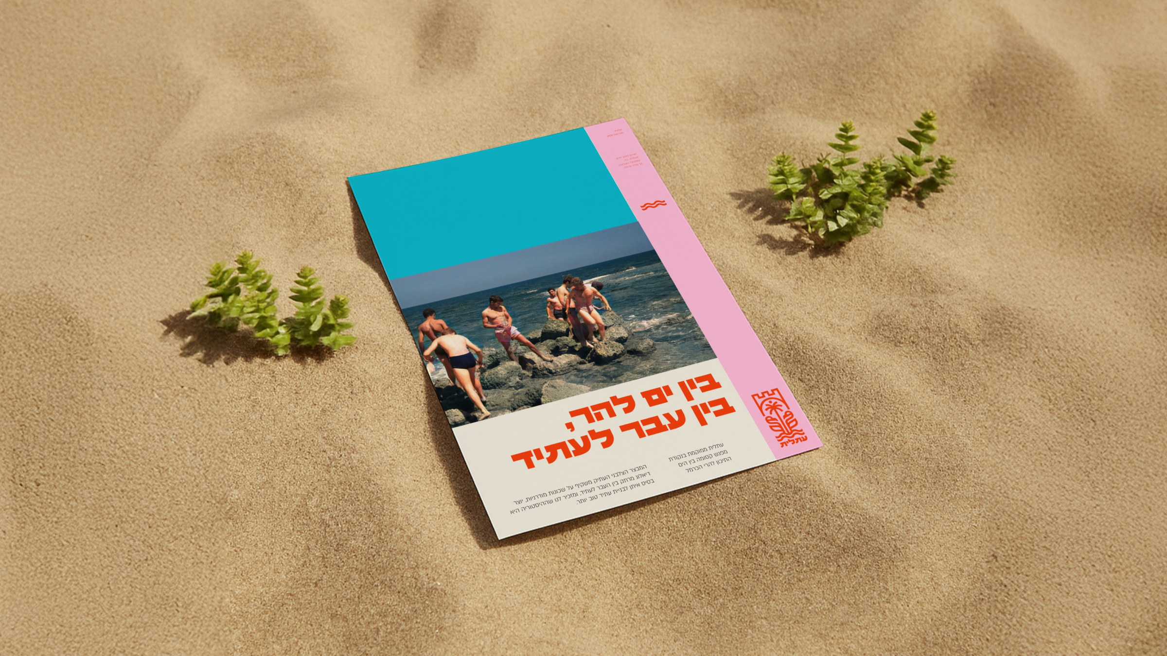
i drove to pick up my daughter naomi from kindergarten in ein hod. i entered atlit and just looked. on one side the sea. not tourist sea. fishermen, salt, wind. on the other side the detention camp where thousands of jewish refugees were imprisoned by the british. behind me farmland and washingtonia palms planted by aaron aaronsohn, soil still giving. ahead new building young families, kids running.
all at once. heavy past, open future. tragedy and hope. roots and growth.
standing at the traffic light i understood. atlit holds contradictions without apology. it doesn't erase pain and doesn't get stuck in it. it keeps going. layer on layer. generation after generation. heartbreaking and uplifting at the same time. a prism of israel itself.
in the kindergarten parking lot, salt in the air, kids laughing, i knew this isn't design. it's trying to capture a feeling. a place that remembers everything and moves forward anyway.
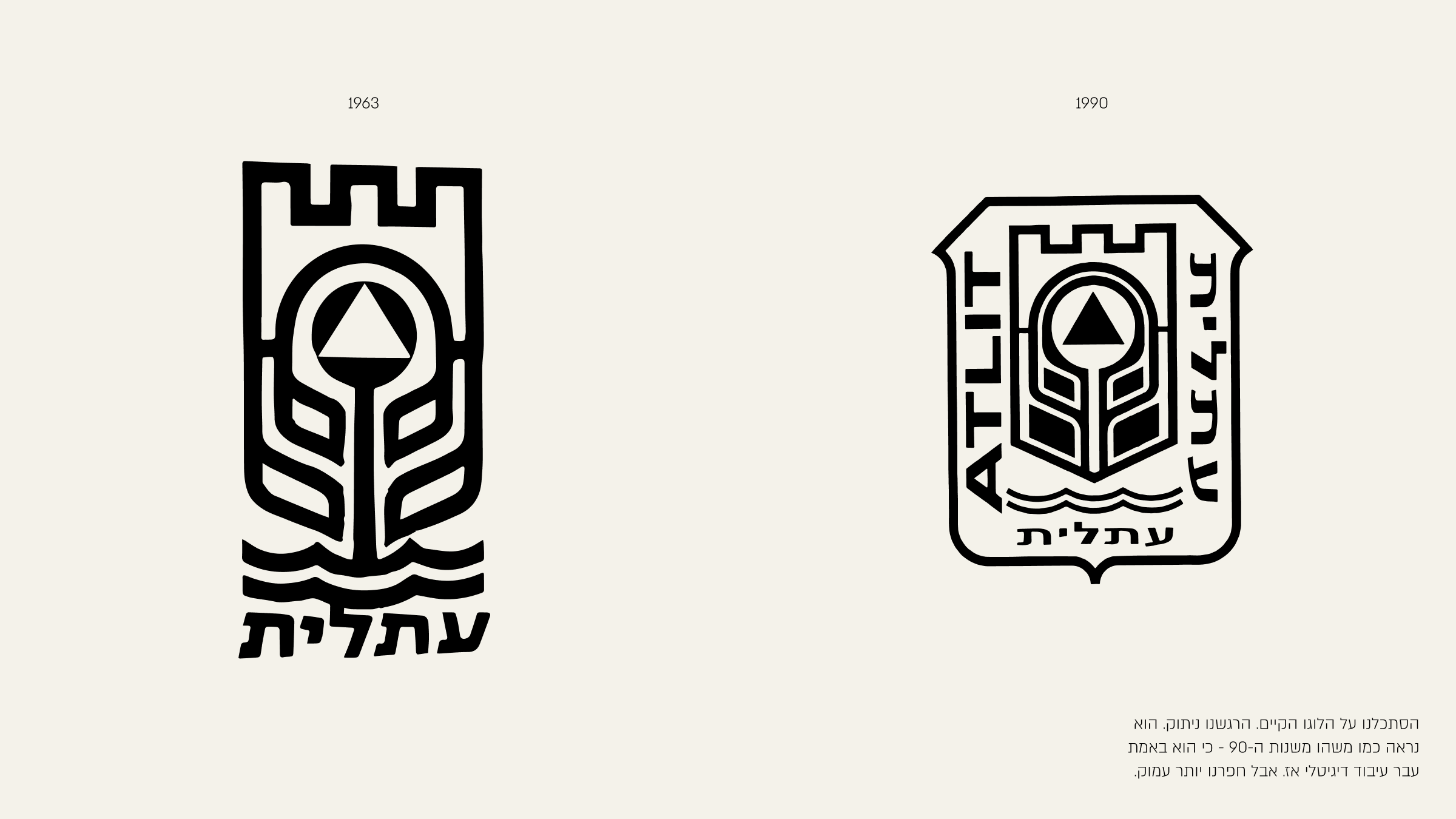
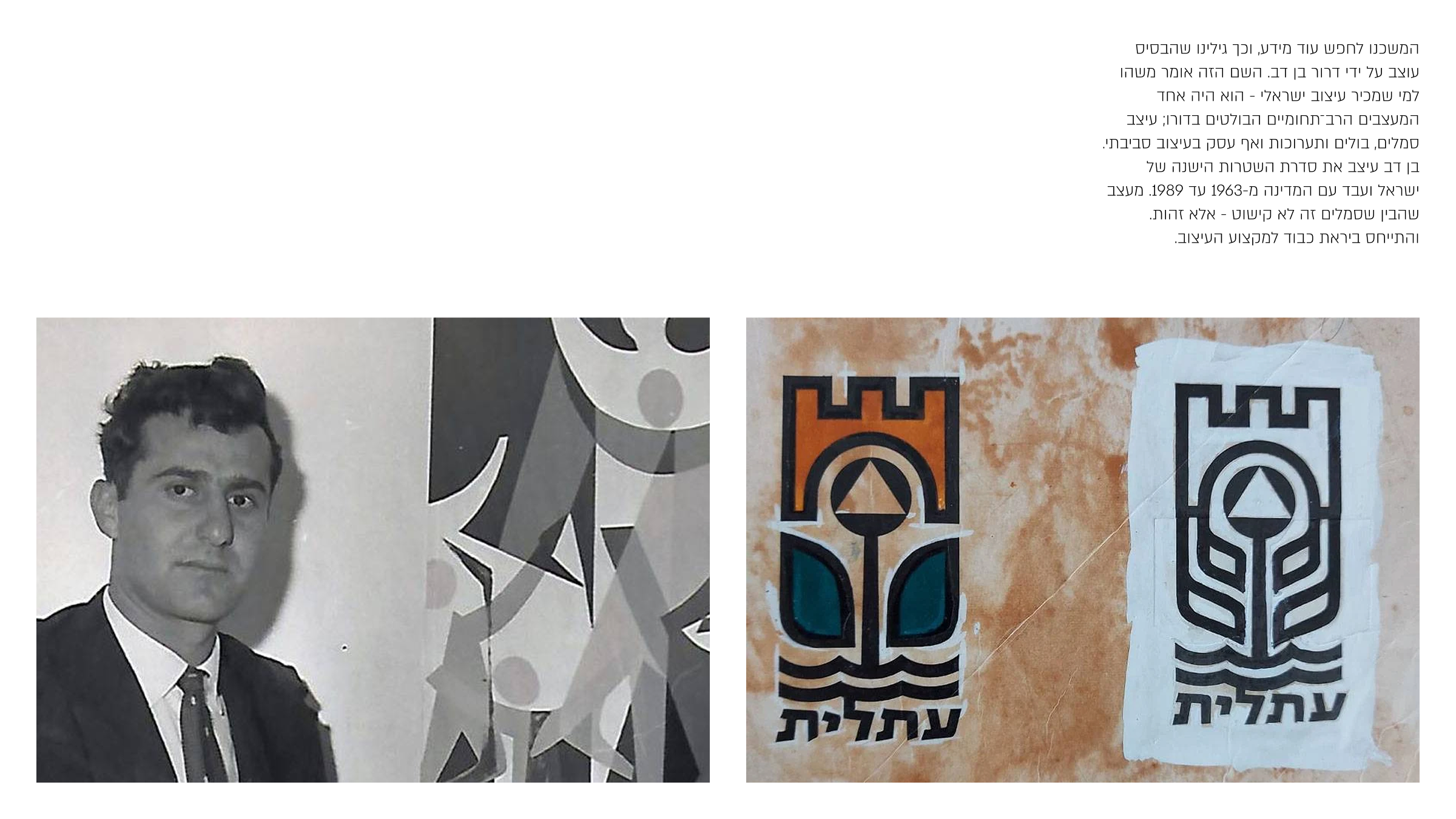
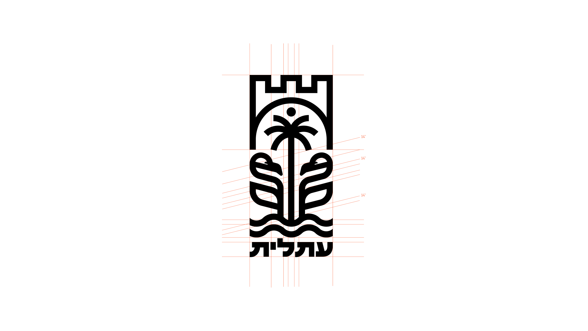
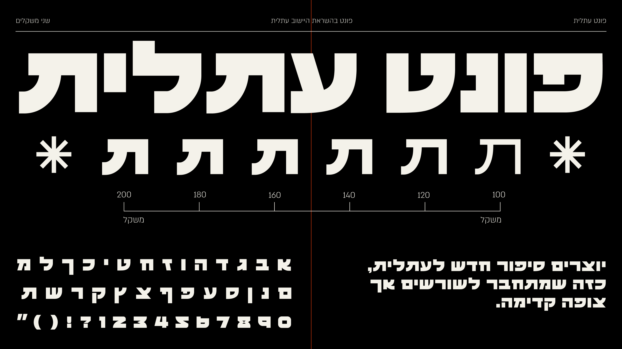
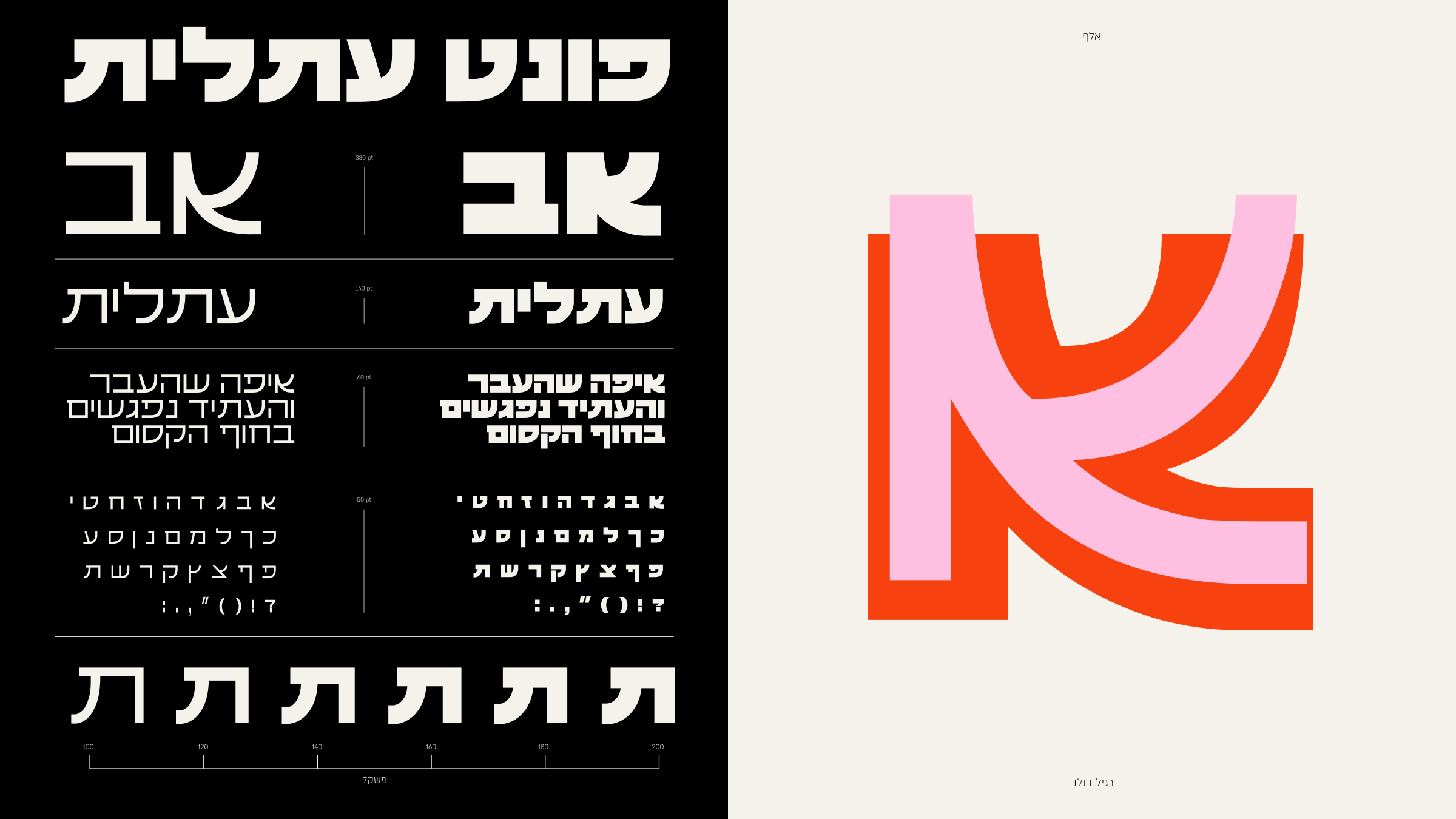
we looked at the old logo. it felt disconnected. it looked like the 90s because it was digitized then. but we dug deeper.
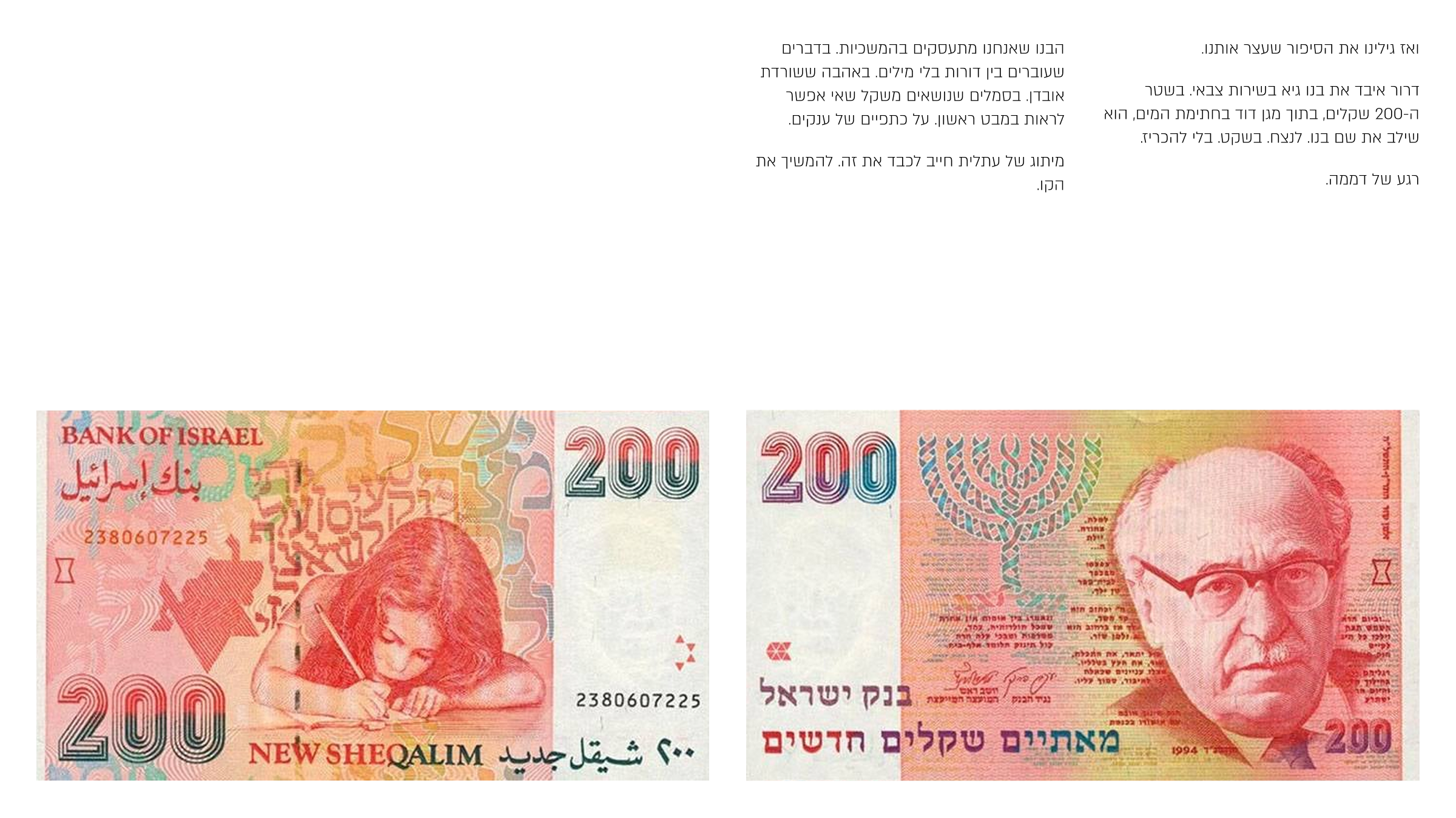
i searched and found the original was designed by dror ben dov. a big name in israeli design. he designed the old banknotes. worked with the state from 1963 to 1989. he knew symbols are not decoration. they are identity.
then we found the story that stopped us.
dror lost his son guy during army service. in the 200 shekel side the star of david watermark, he hid his son's name. forever. quietly.
silence.
this is about continuity. things passed between generations without words. love that survives loss. symbols that carry weight you don't see at first. standing on the shoulders of giants.
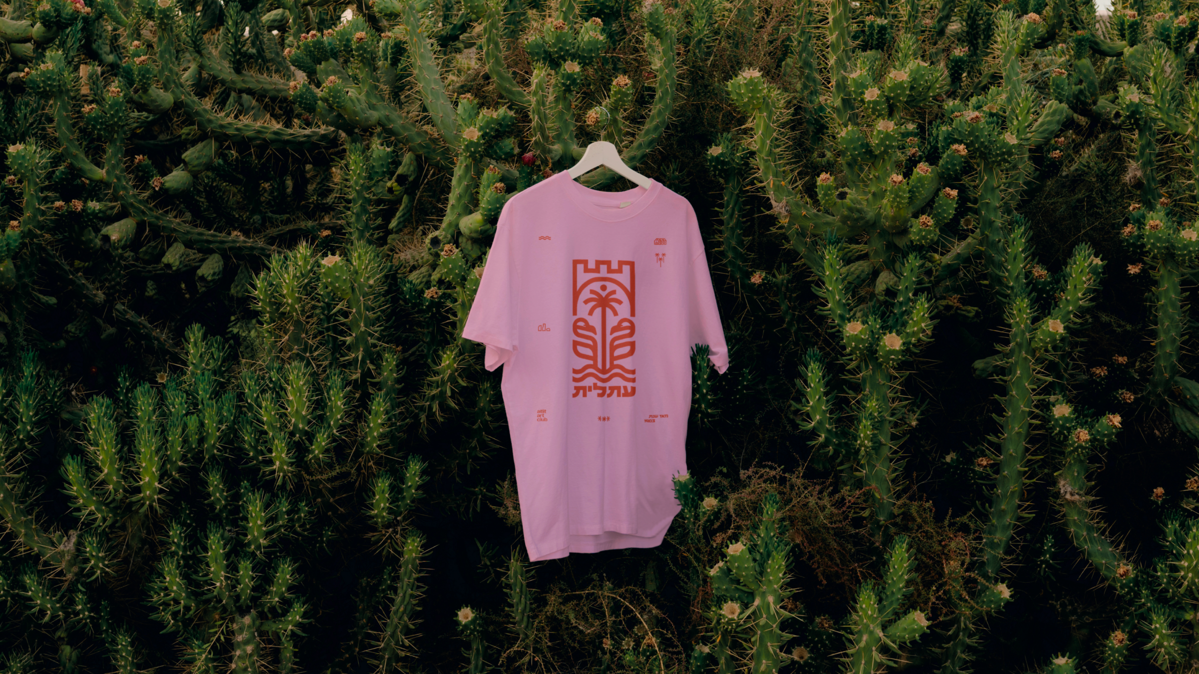
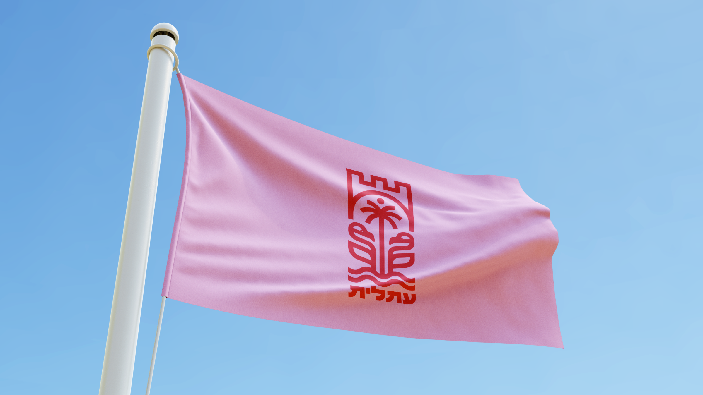
atlit's branding had to respect that. continue the line.
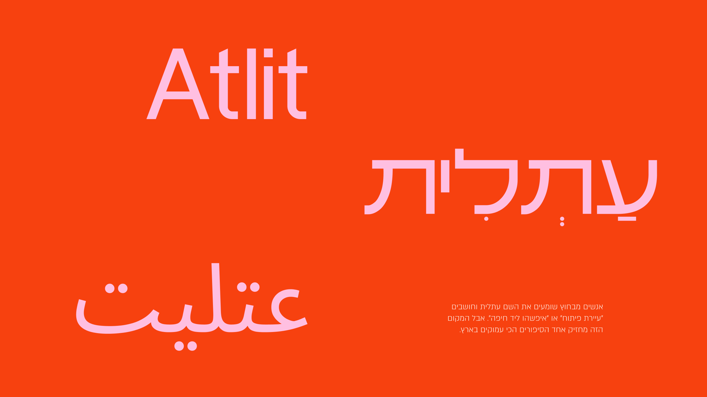
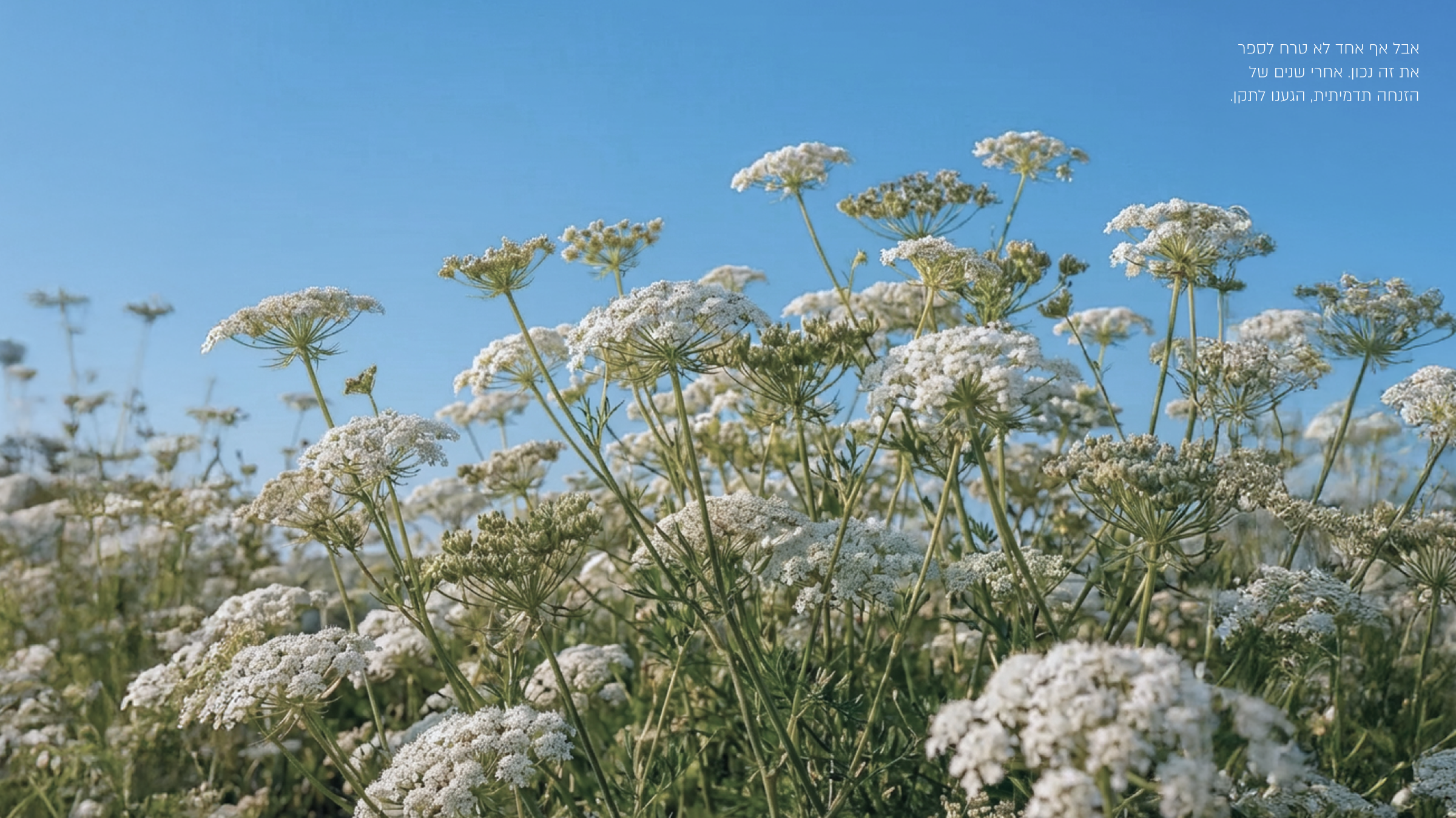
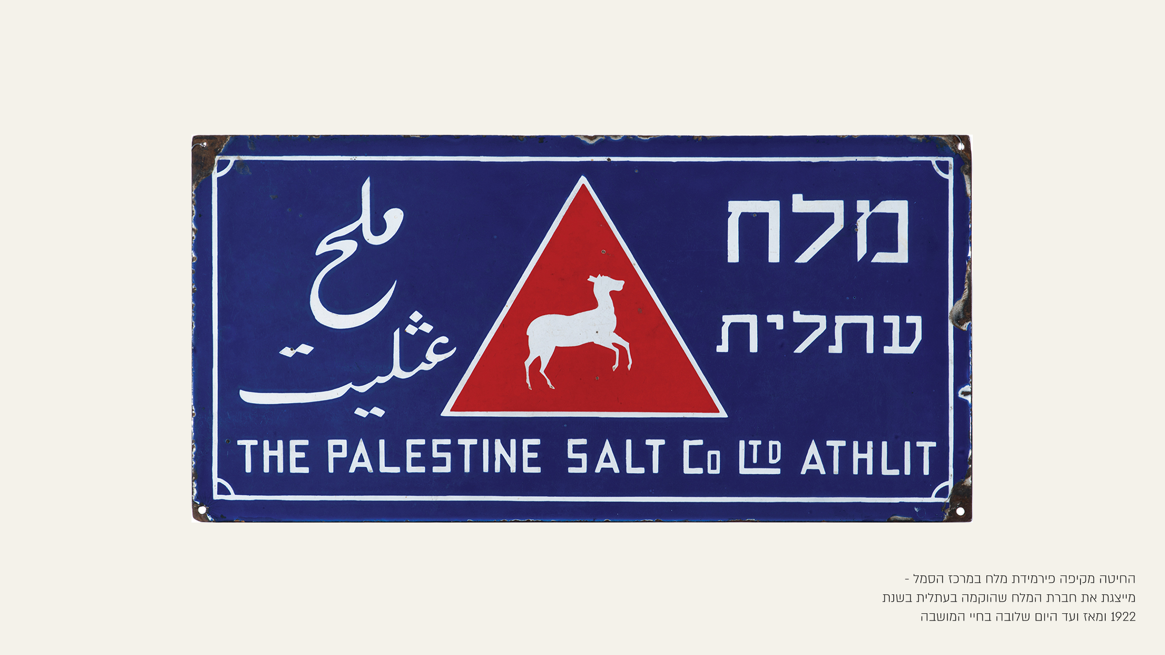
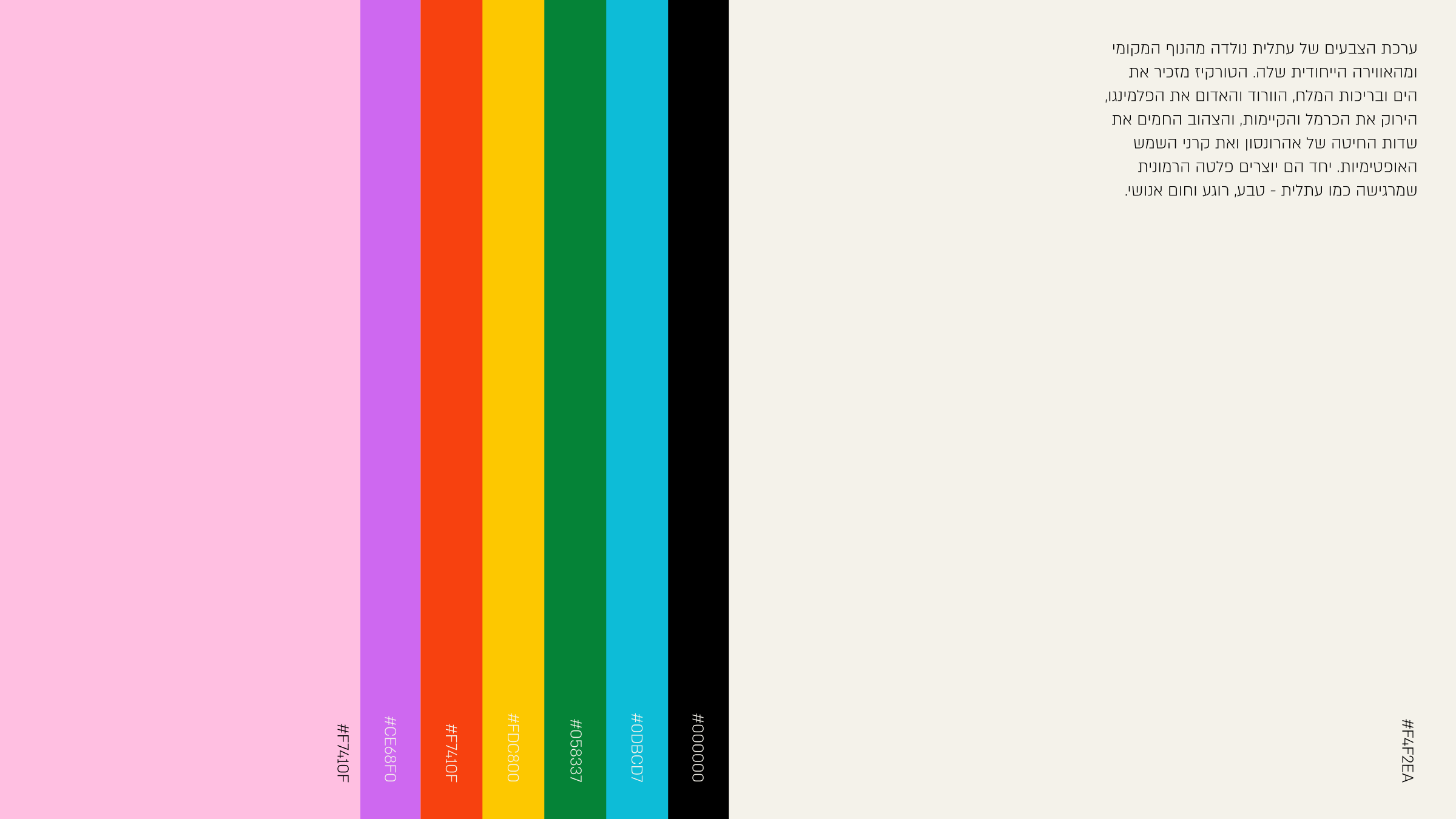
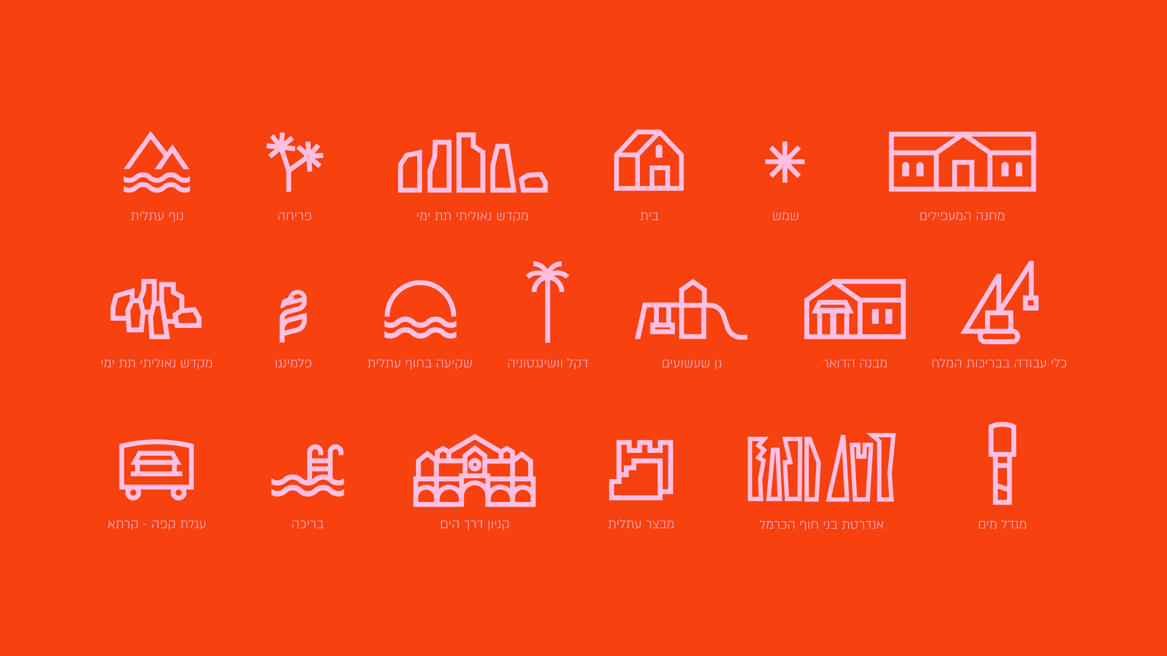
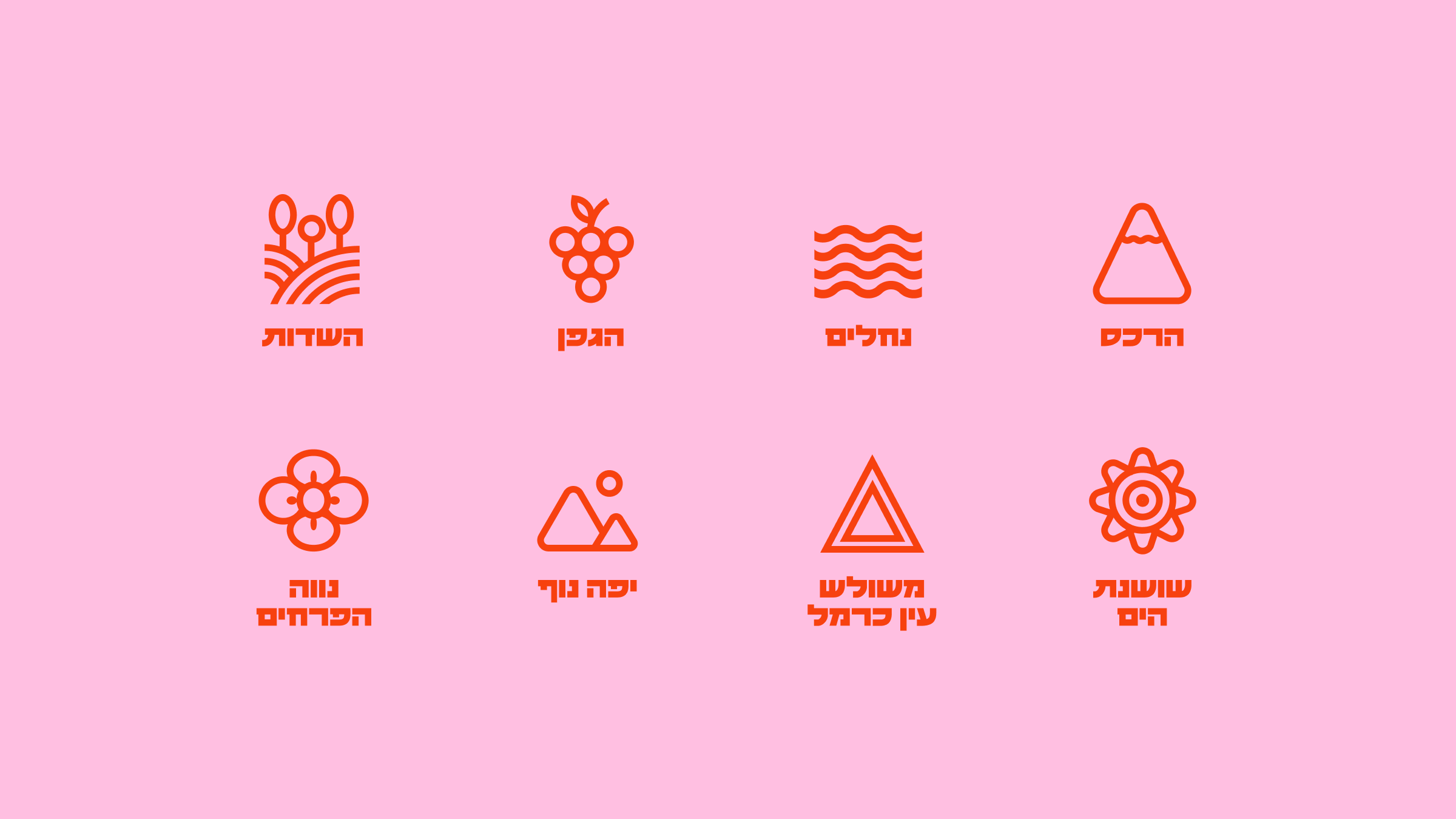
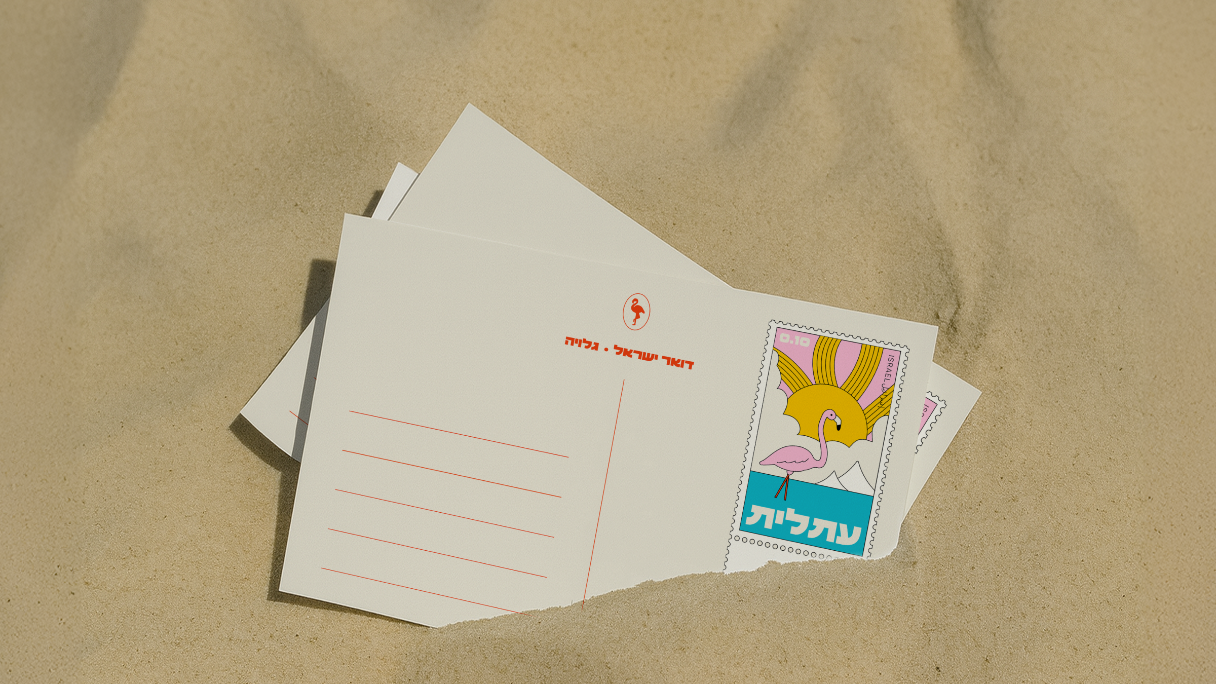
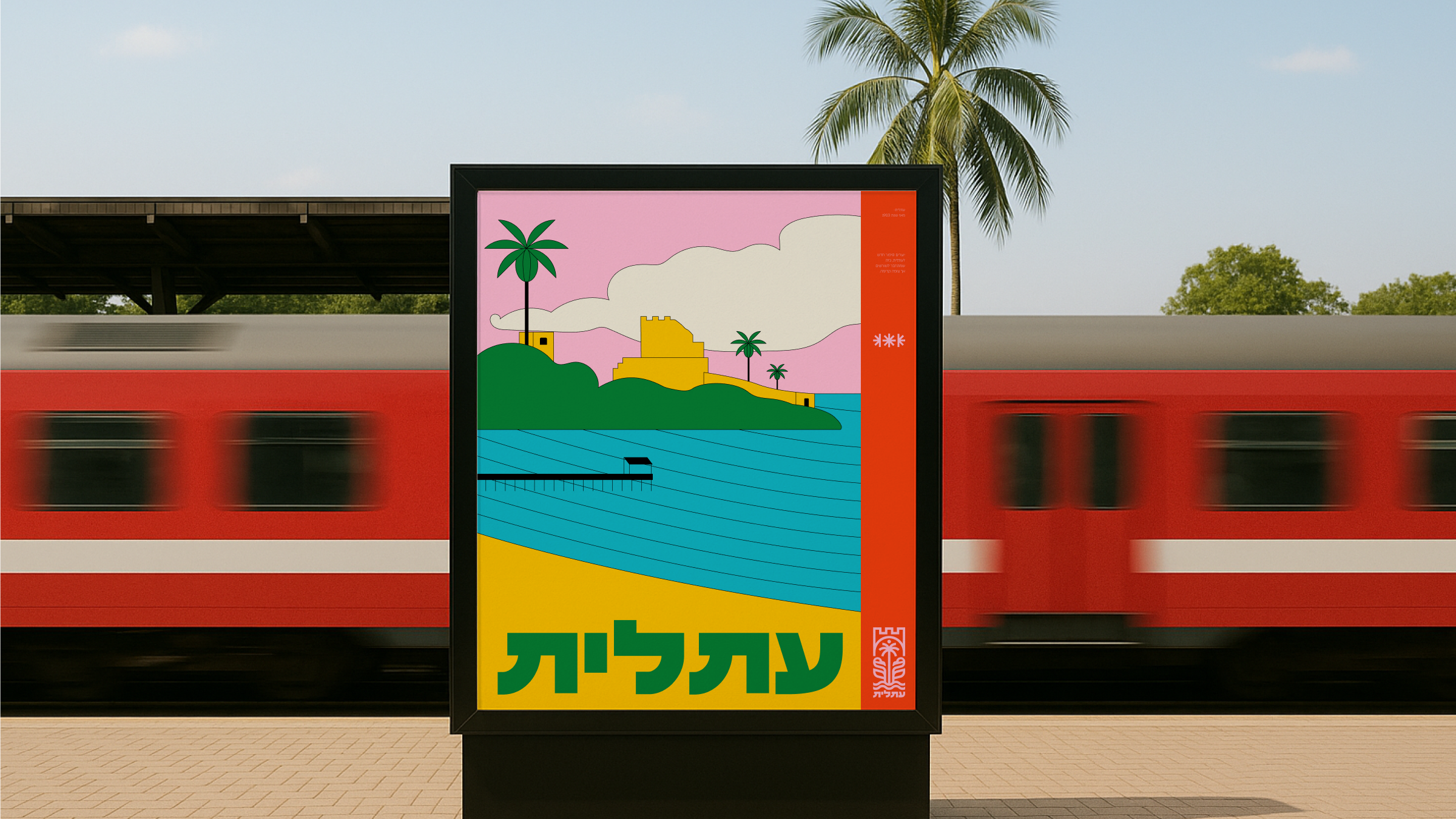
the name atlit comes from an ancient semitic root, meaning coastal plants, salty soil. no one invented it. it grew from the ground. the land here is salty, hard, unforgiving. and still things grow.
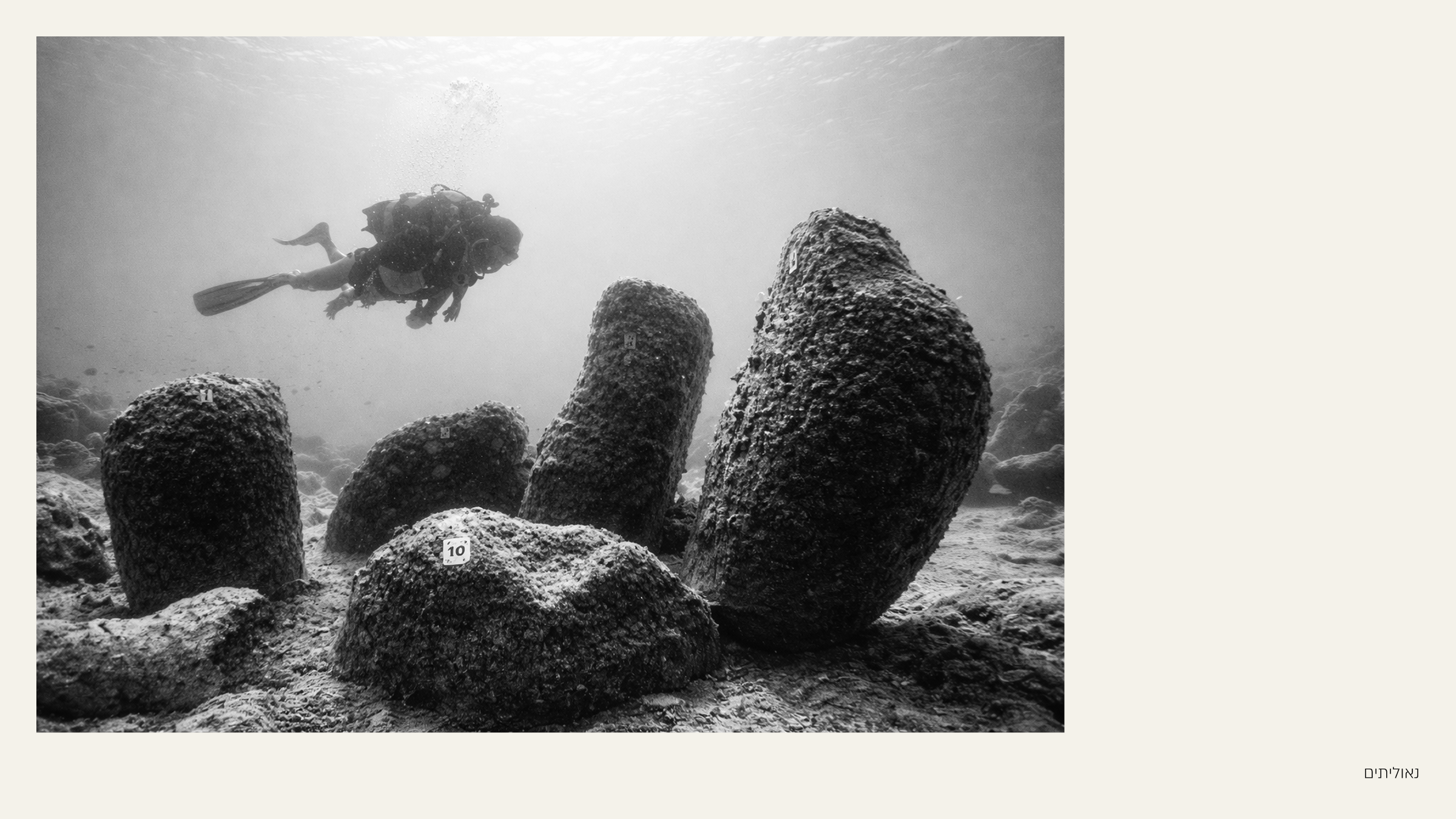
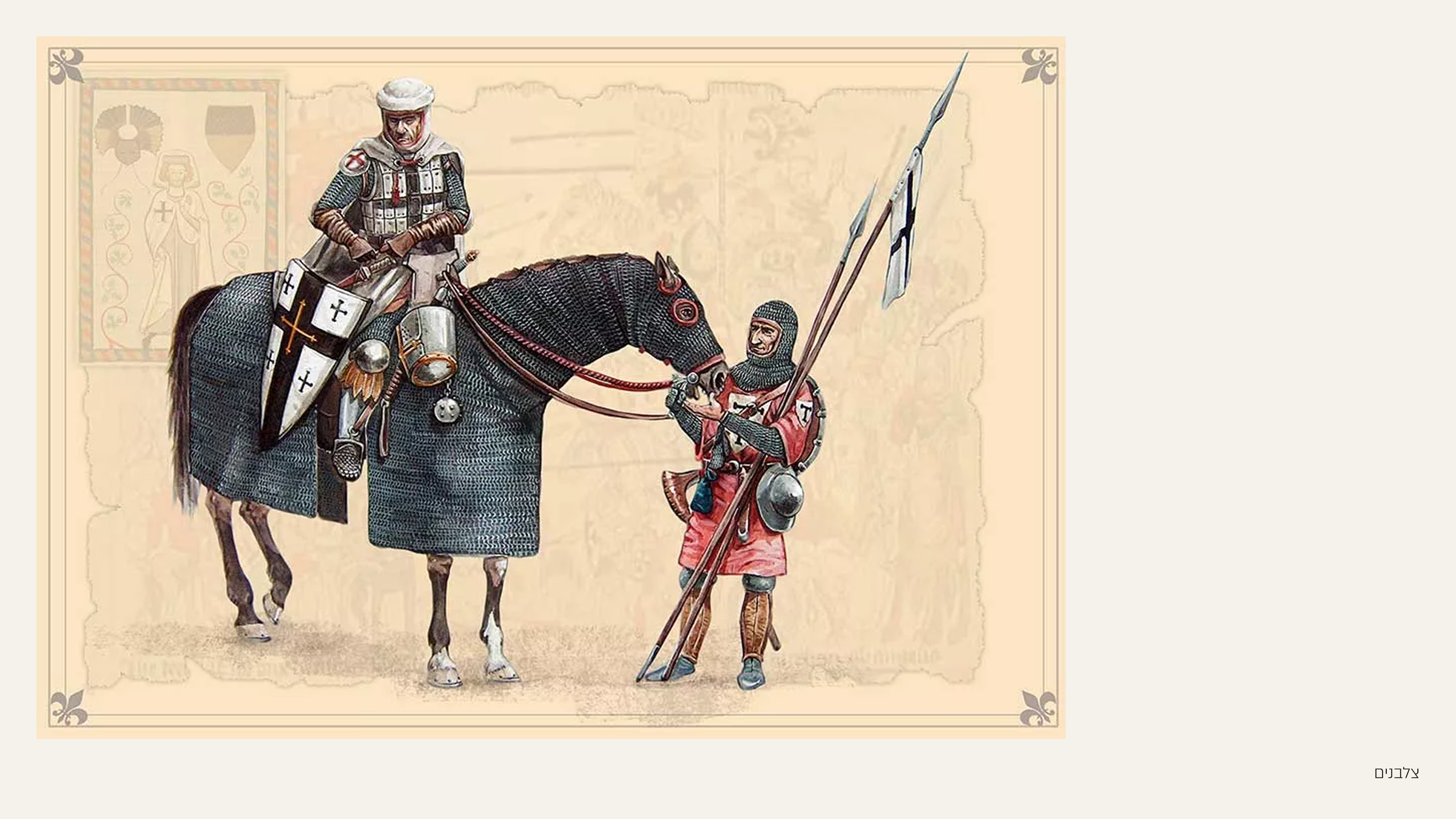
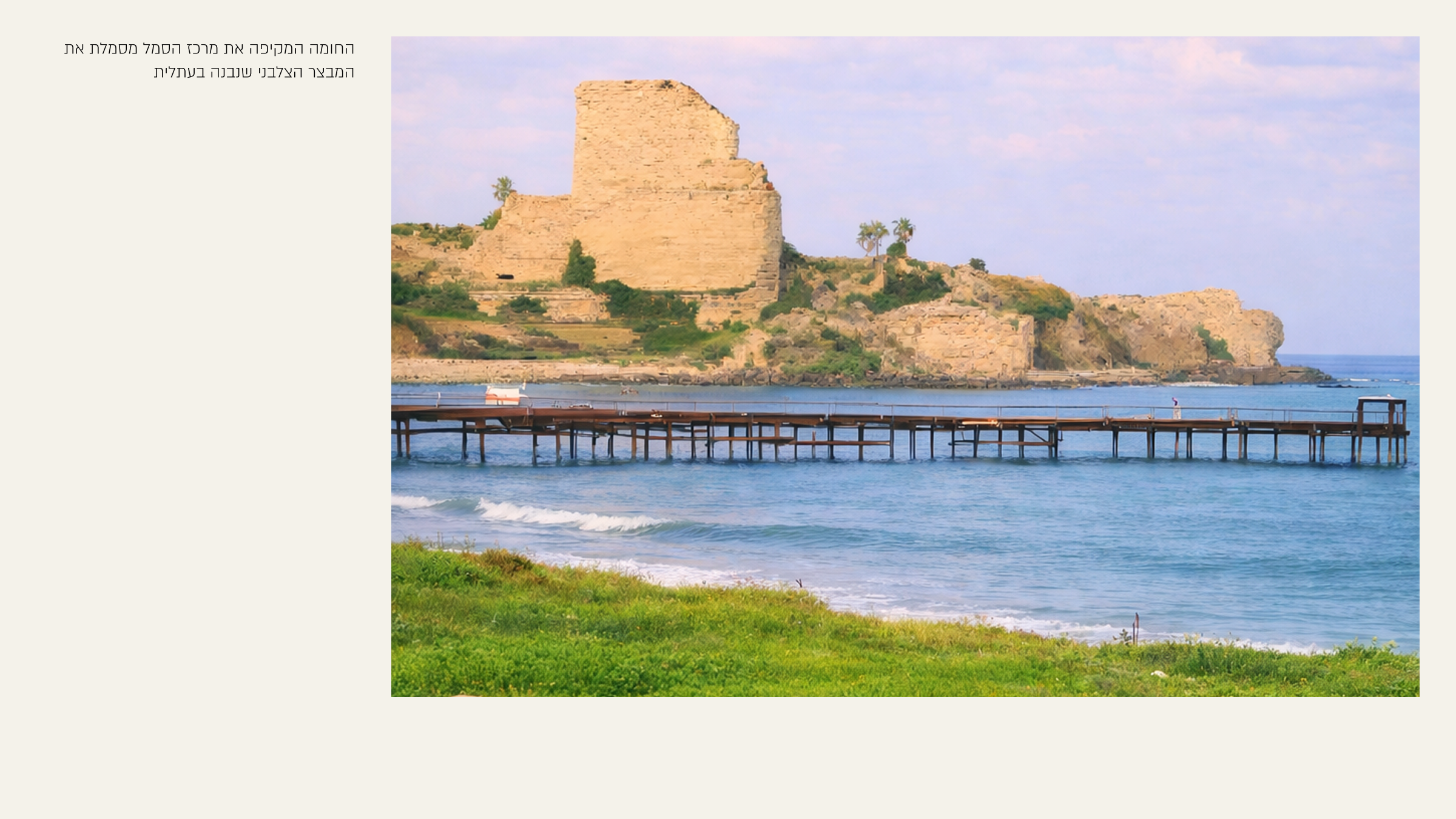
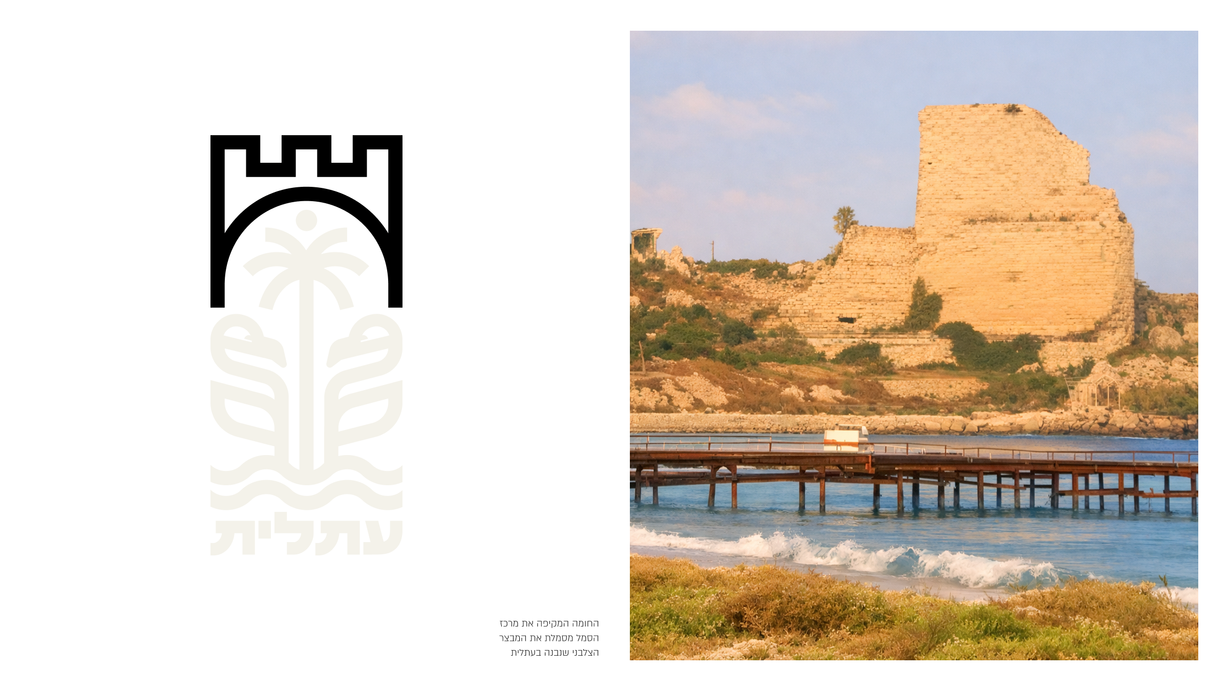
there's a theory of an ancient settlement called atlu, mentioned in egyptian records. the crusaders built a fortress here and called it castle pilgrim. a stop on the way to something bigger. this place was always a passage point. and a place to take root.
in 1903 jews returned and built an agricultural research station. they brought back the ancient name. not invented. restored. humble. knowing the place is bigger than any one generation.
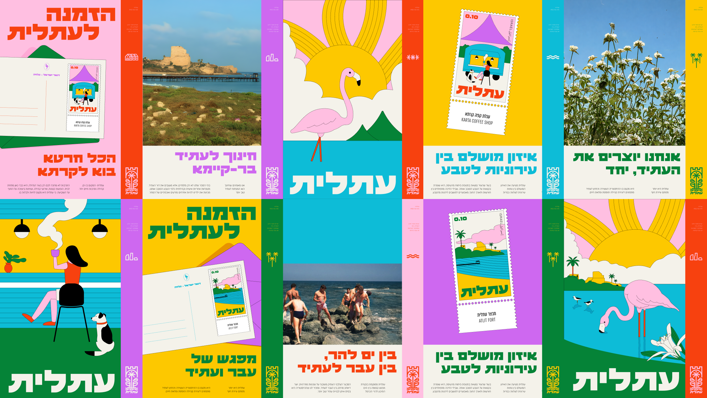
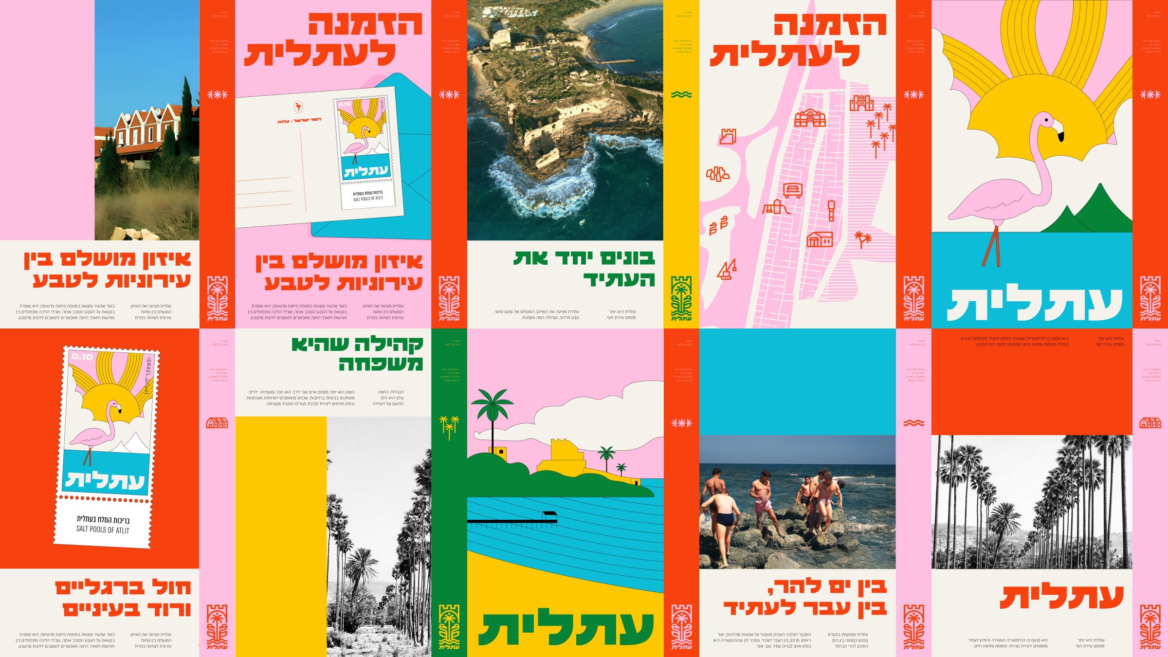
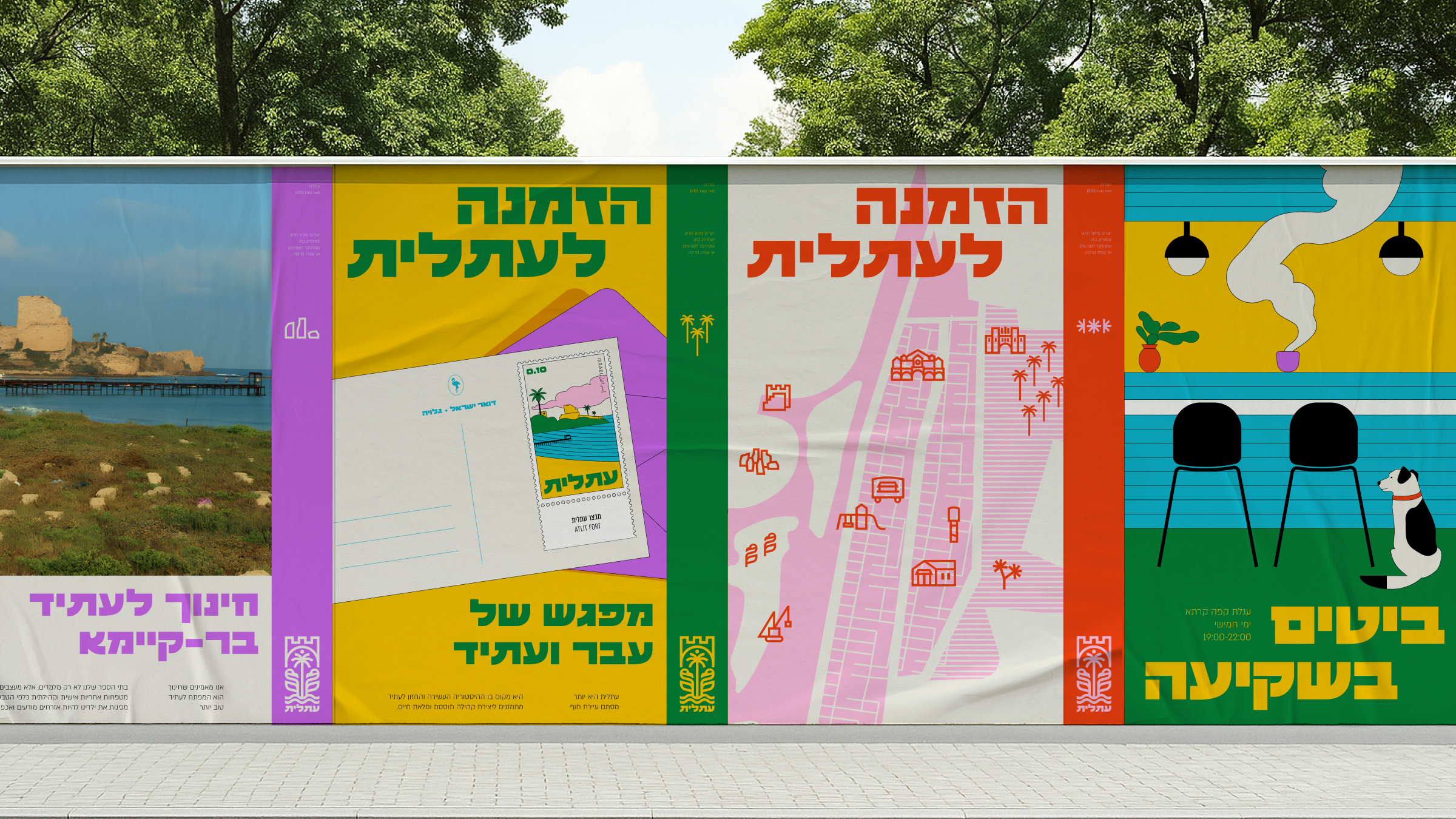
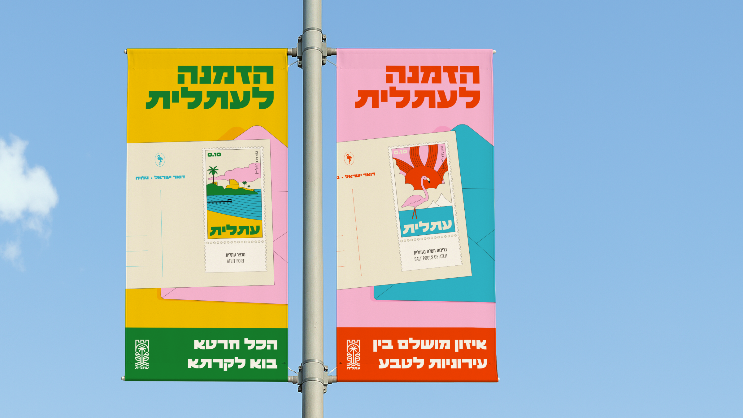
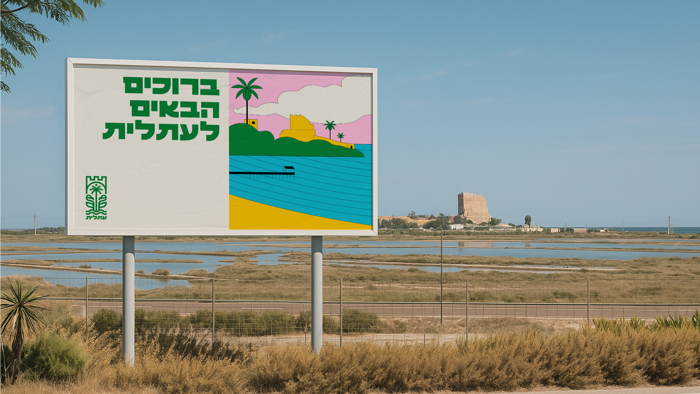
the new branding doesn't invent a story. it listens to what the place already says.
city and nature together.
new and old together.
memory and hope together.
atlit invites a certain kind of life. life on land that remembers everything and still gives. life in a community that knows where it came from and isn't afraid of what's next.
the branding just says it out loud. for the first time.
creative director | eden vidal, inbal vidal
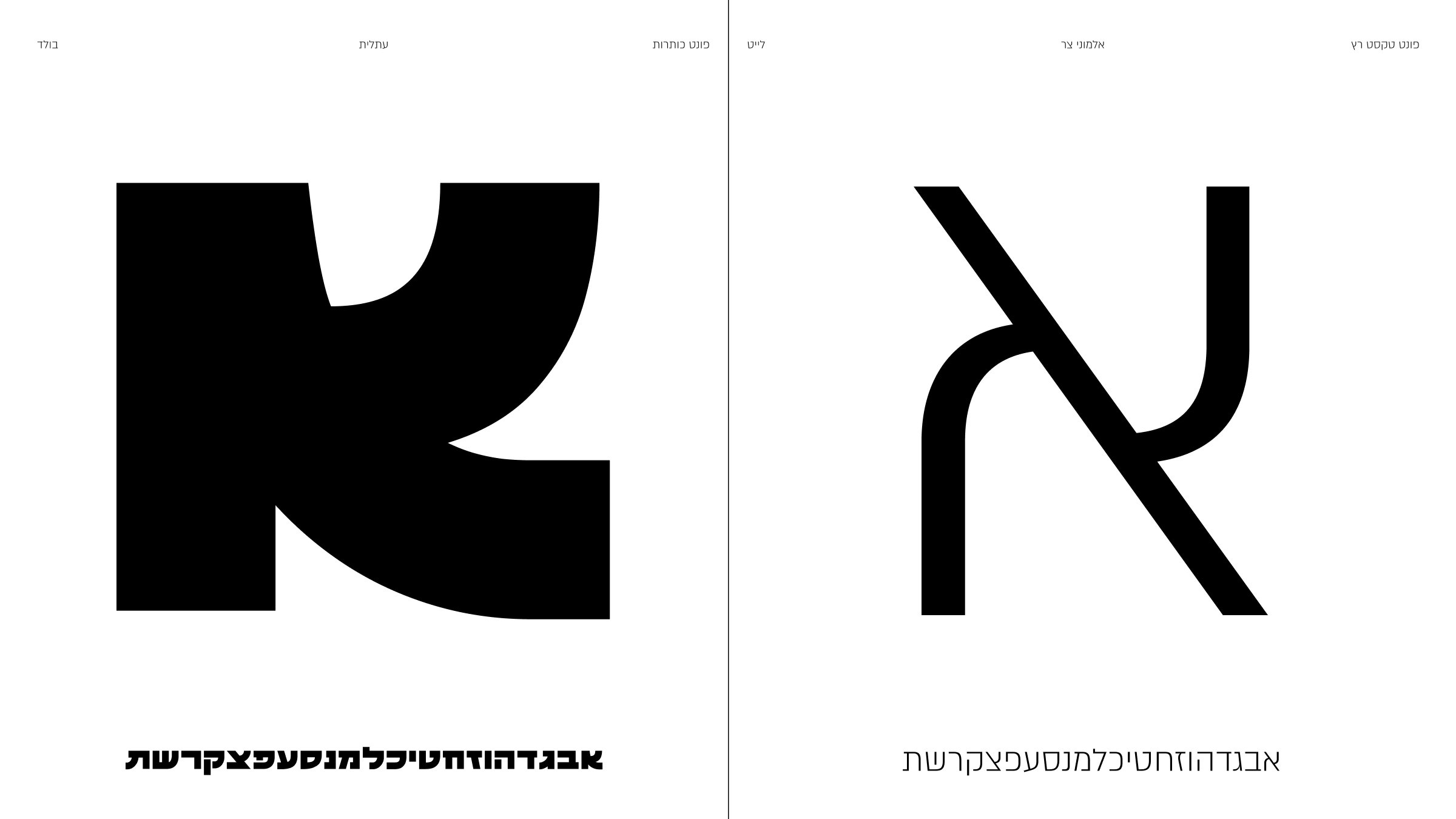
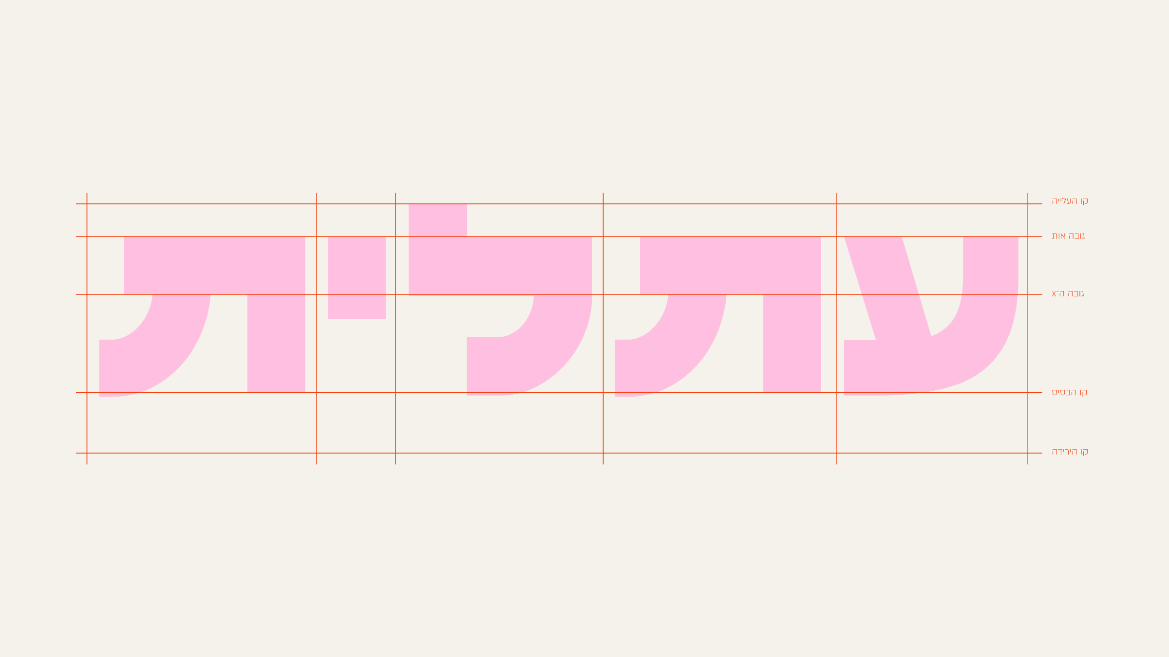
brand and type designer designer | hadar lozon
designer | maya rachamim
illustrator | shira cohen